EASY CAR HIRE
A Car Rental App
from research to user journey, including workflows and wireframes
CONTEXT
Travellers may not always be able or willing to take trains or planes to visit various places at a certain distance. A car rental app would provide convenience and cost-saving options. They could rent cars and compare prices among different companies from anywhere at any time, without having to visit physical rental venues. With a car rental app, they could have more flexibility in their travel plans and explore different places at their own pace.
MY ROLE
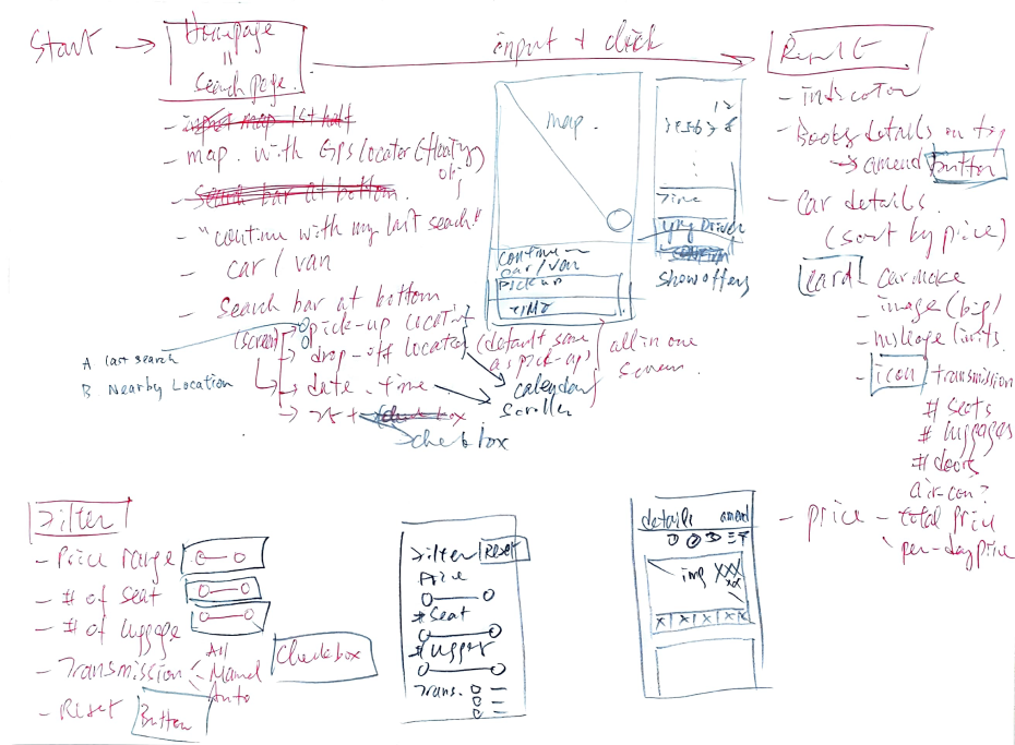
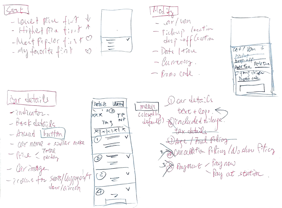
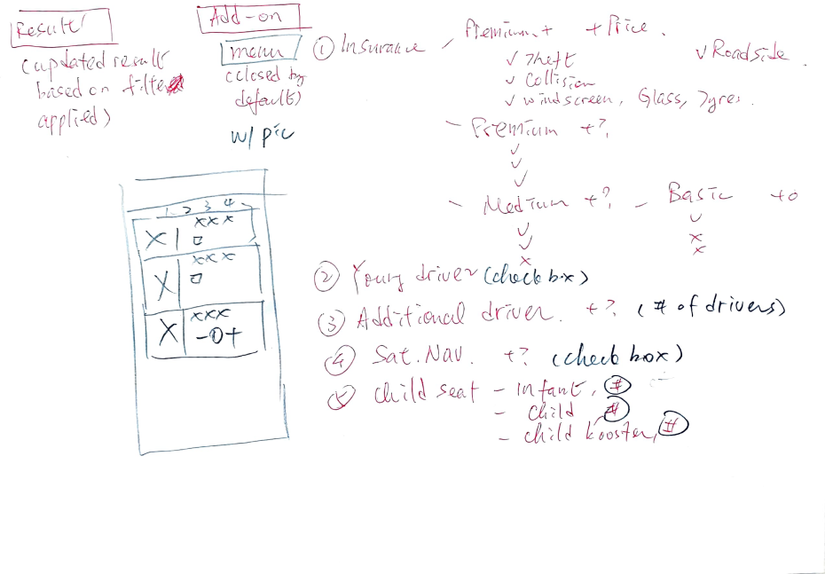
My role in this project involved conducting competitive analysis, user research, analysing data, designing workflow, low-to-high-fidelity wireframes and clickable, pixel-perfect prototype.
Tools used: Bandicam, LetsView, MS Word, Figma
Duration: Sep 2022 – Feb 2023 (6 months)
Role: UX Researcher, UX Designer, UI Designer
COMPETITIVE ANALYSIS
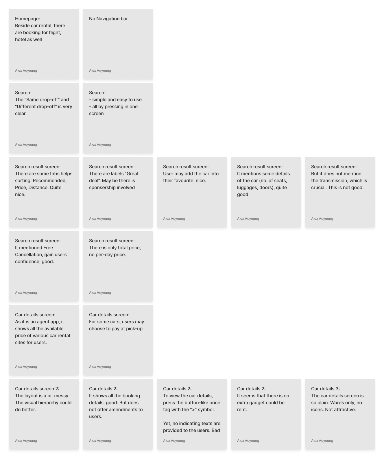
I performed a competitive analysis of four car rental apps available in the market. Through this analysis, I thoroughly examined the booking process and compared the app interfaces and navigation. This activity helped me in gaining a better understanding of user empathy and design conventions from the early stages of the project.
USER RESEARCH
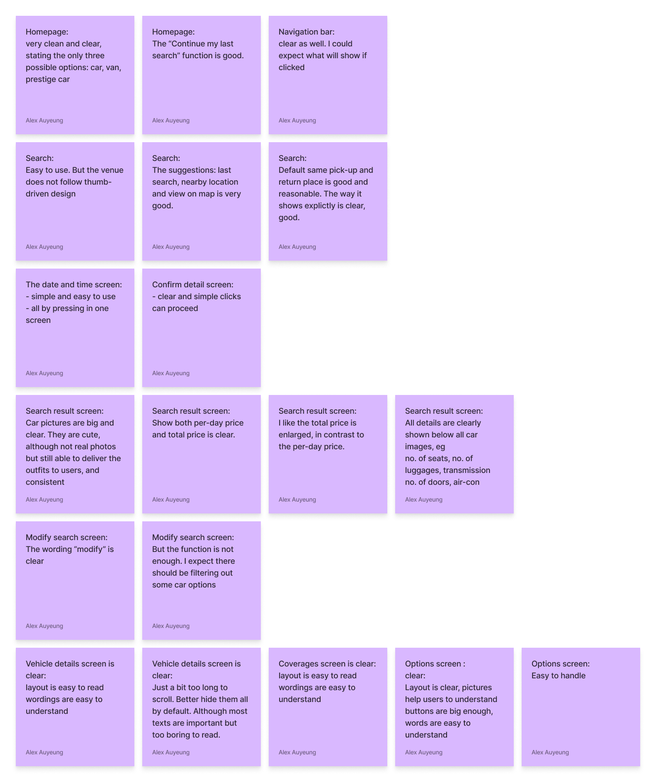
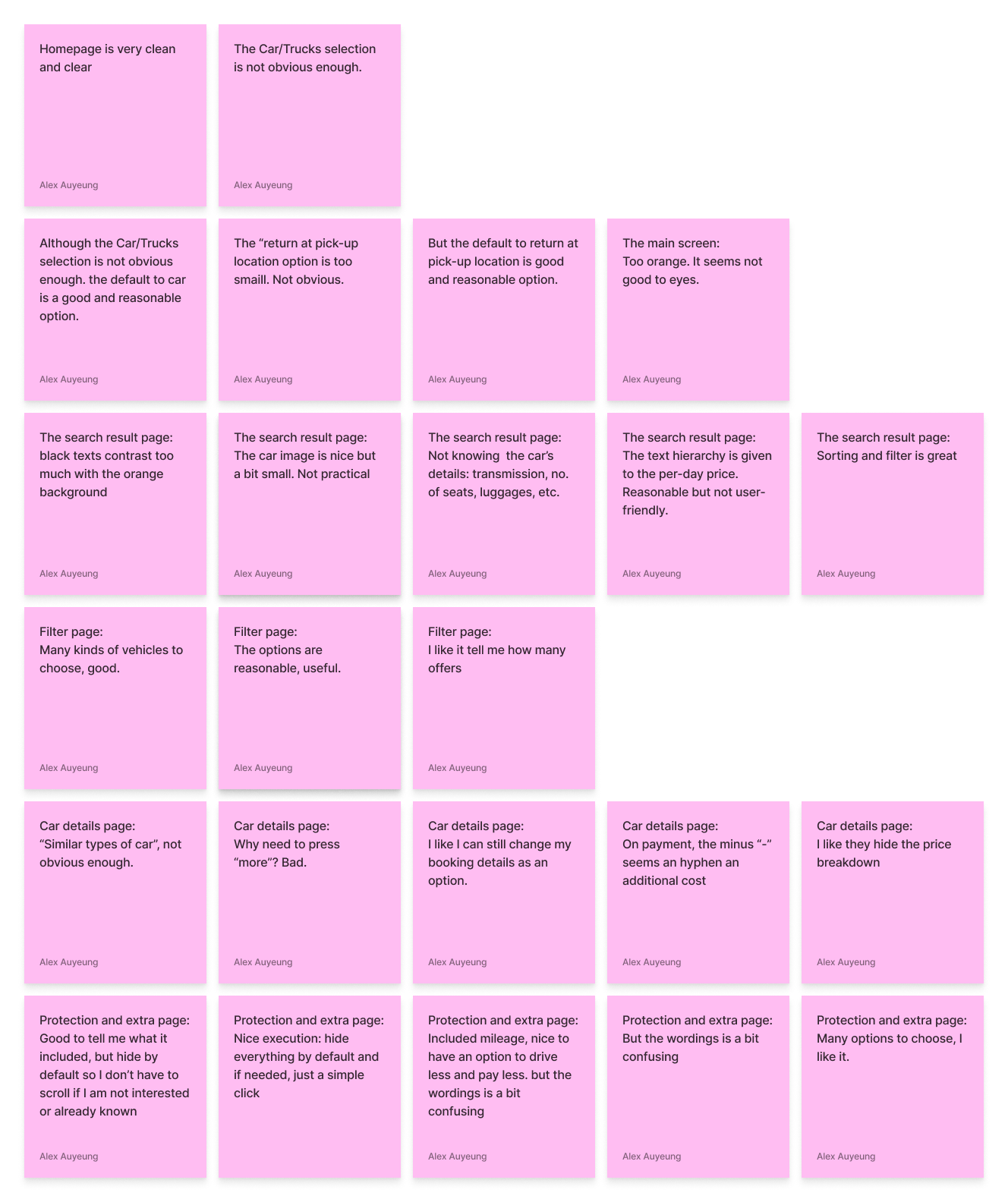
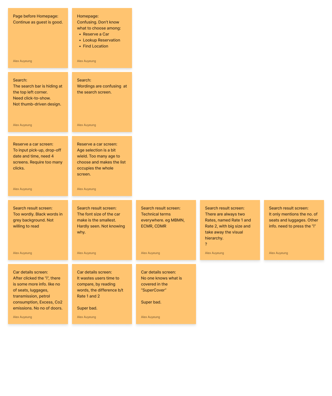
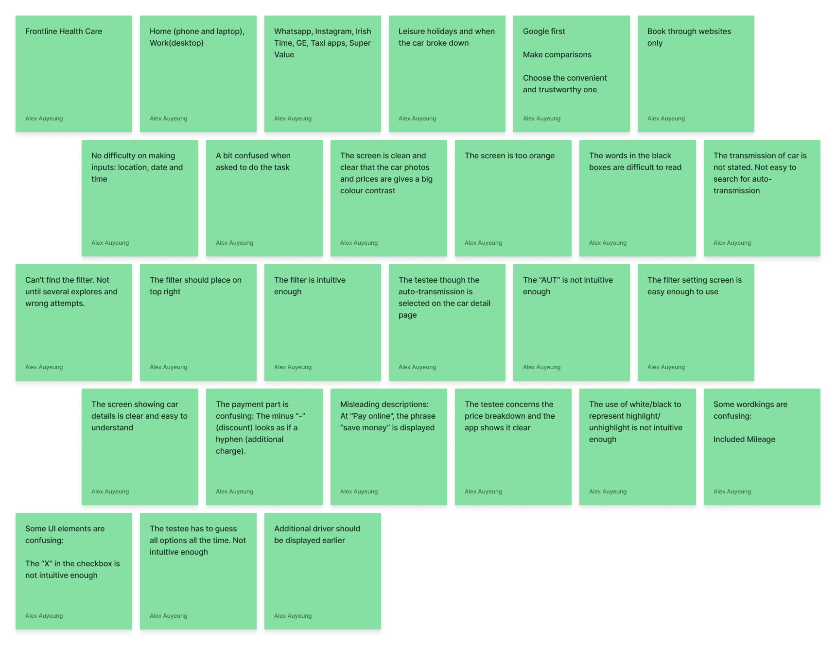
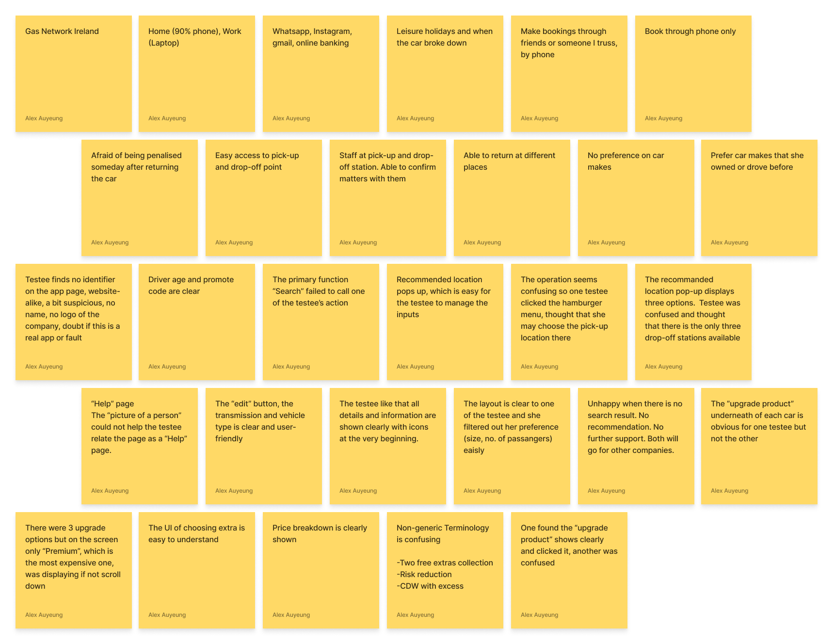
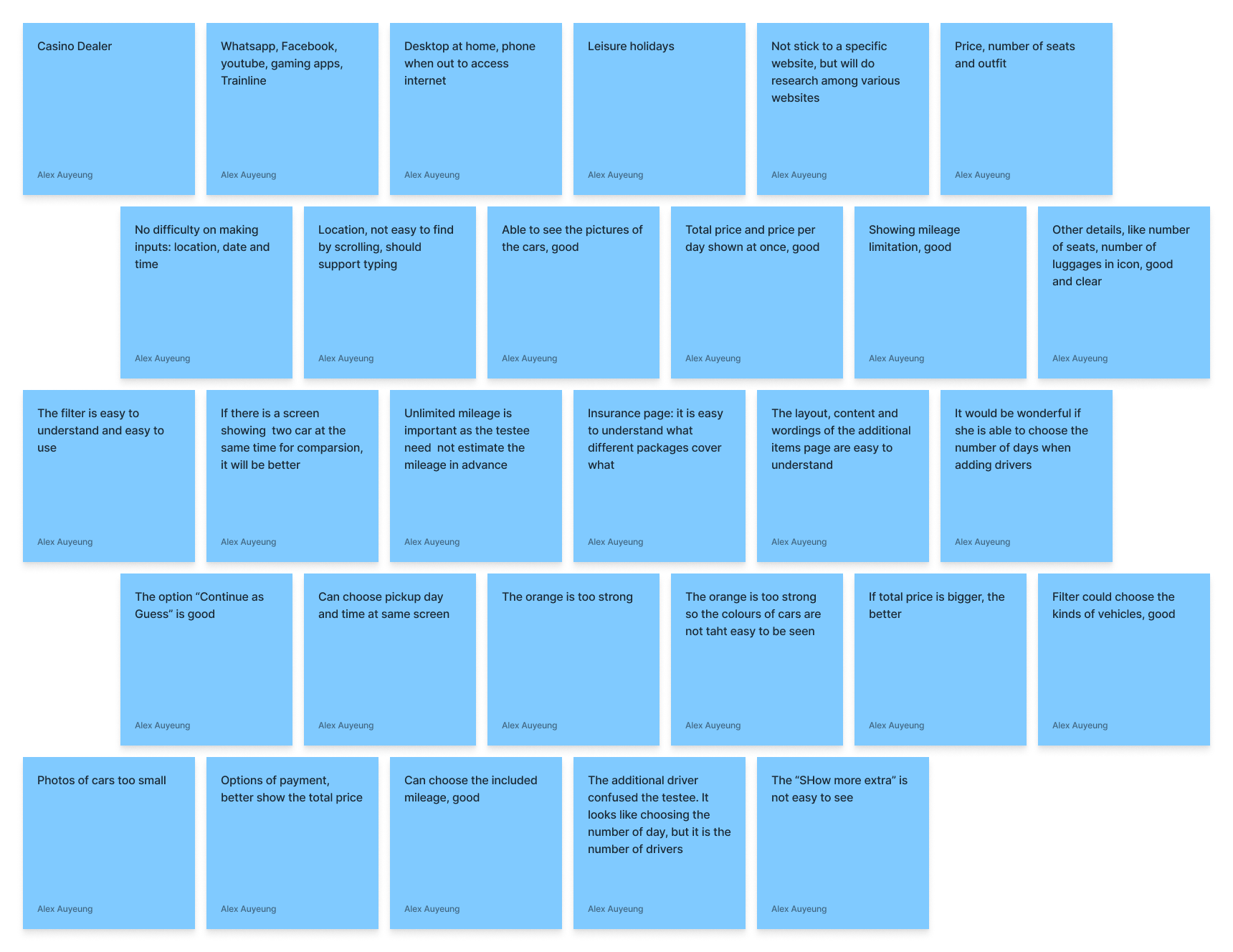
After gaining insights from the competitive analysis, I conducted three research interviews to understand the motivations and experiences of users with existing car rental products.
My goal was to identify pain points and gather feedback on how users felt while trying to rent a car. This information was crucial for designing a car rental app that provides an easy and intuitive experience to users.
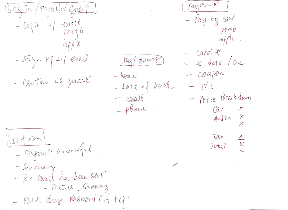
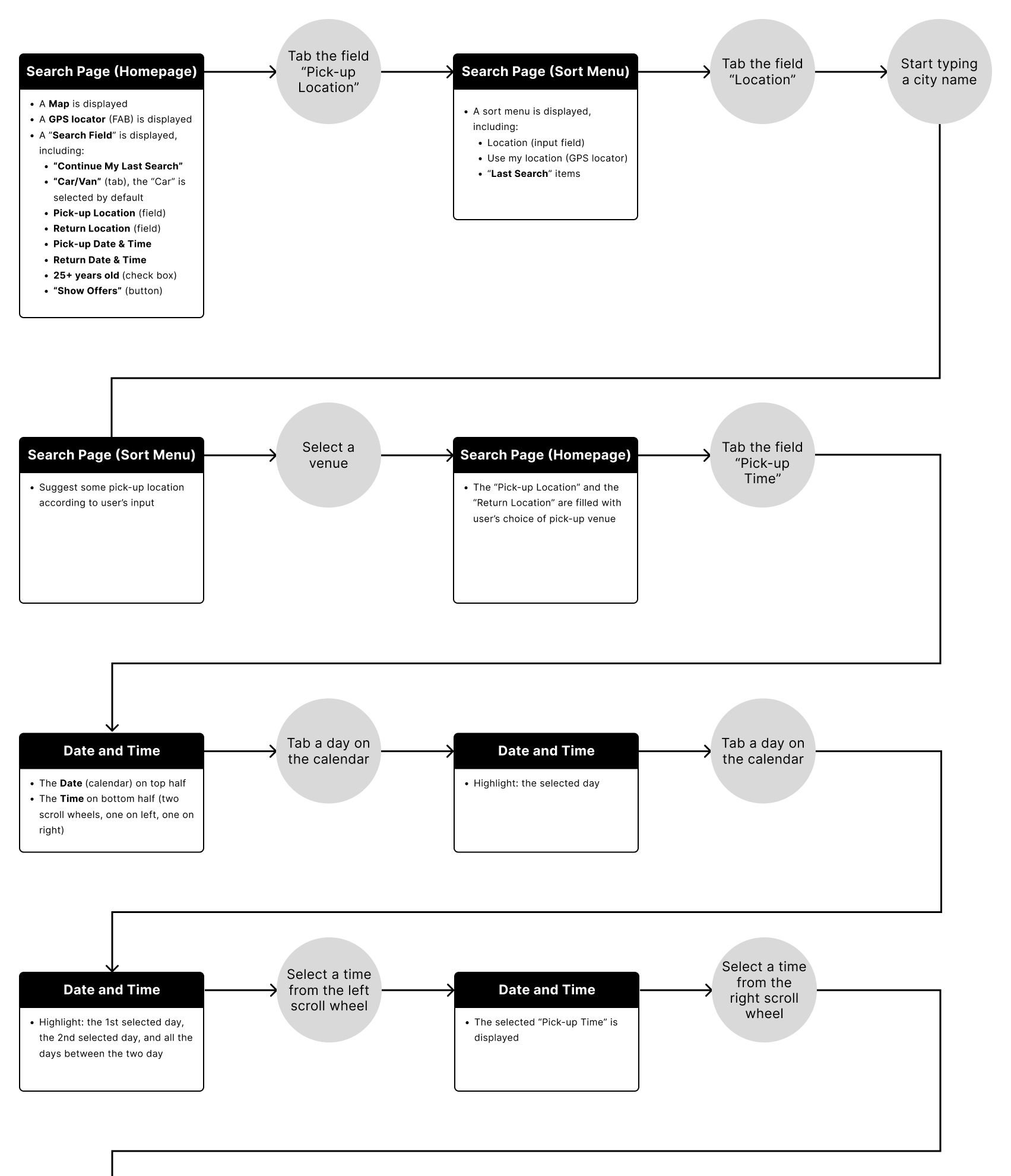
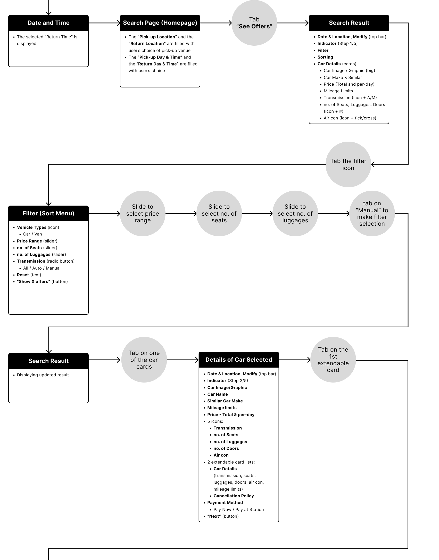
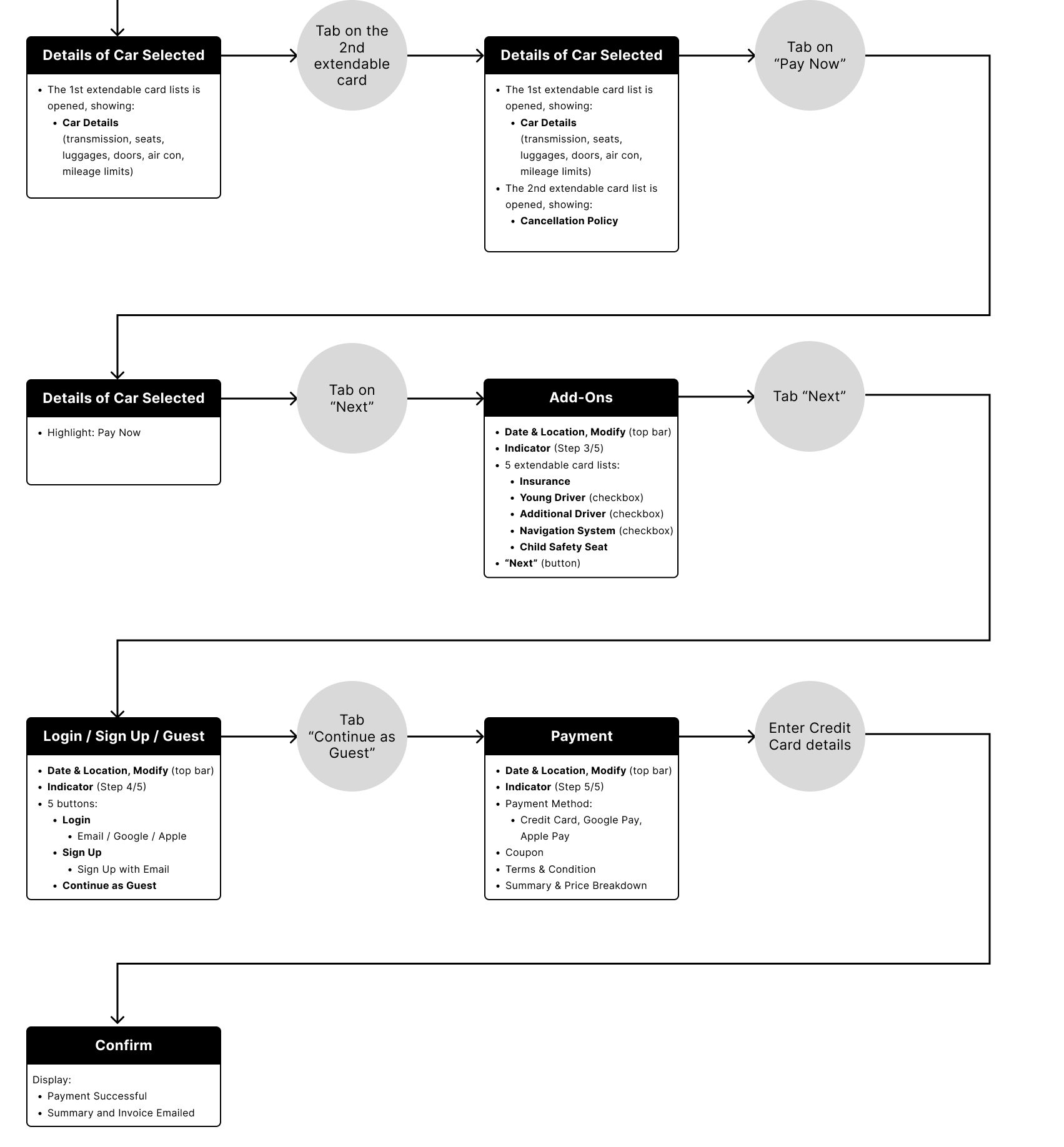
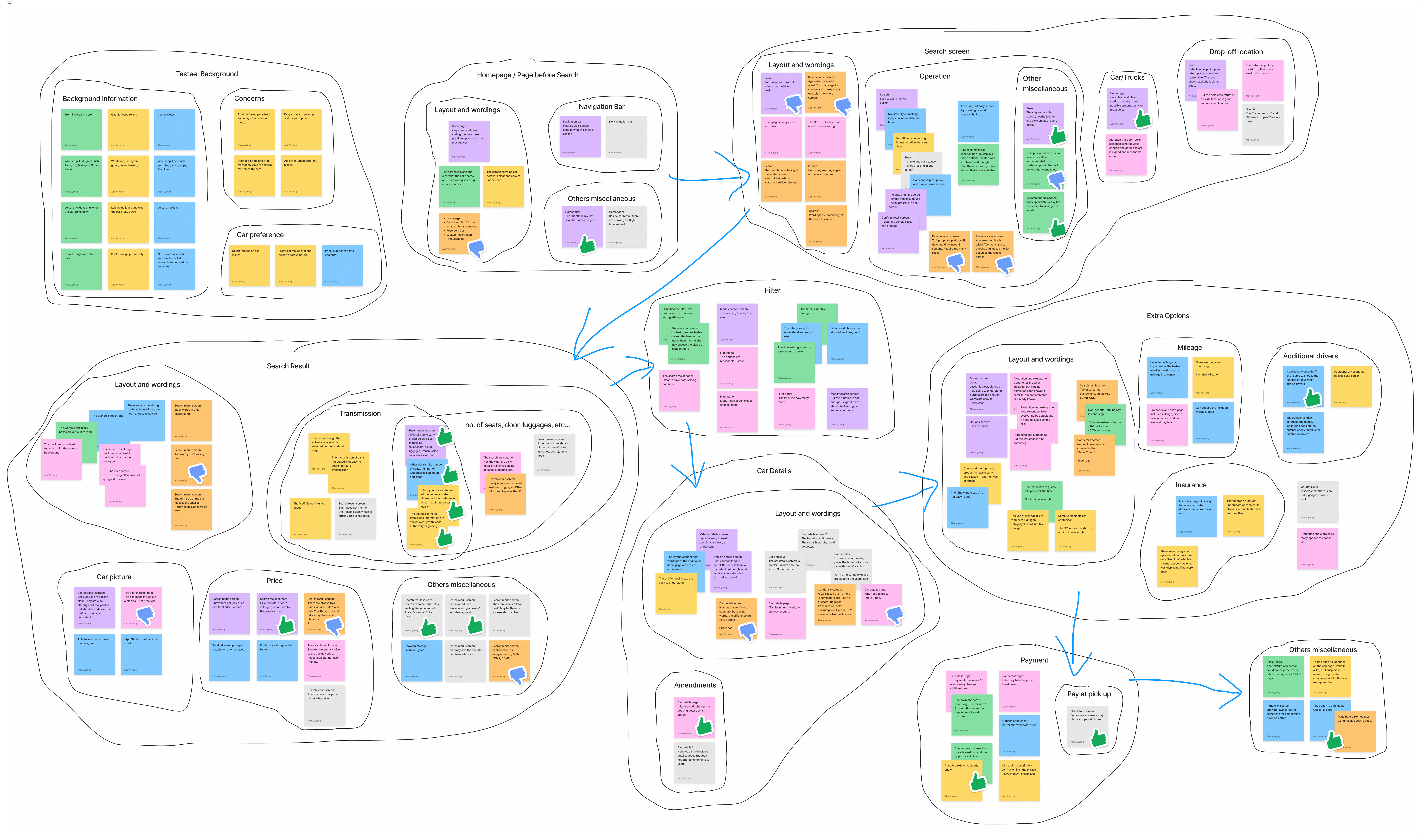
I condensed the feedback and insights from the user research into 9 groups, each corresponding to one of the 7 steps or screen states involved in the process of renting a car, from the homepage through to payment. In addition to considering the specific features required for each screen, I also took into account the layout and microcopy used in other apps to ensure that the screens I designed were user-friendly.
USER JOURNEY
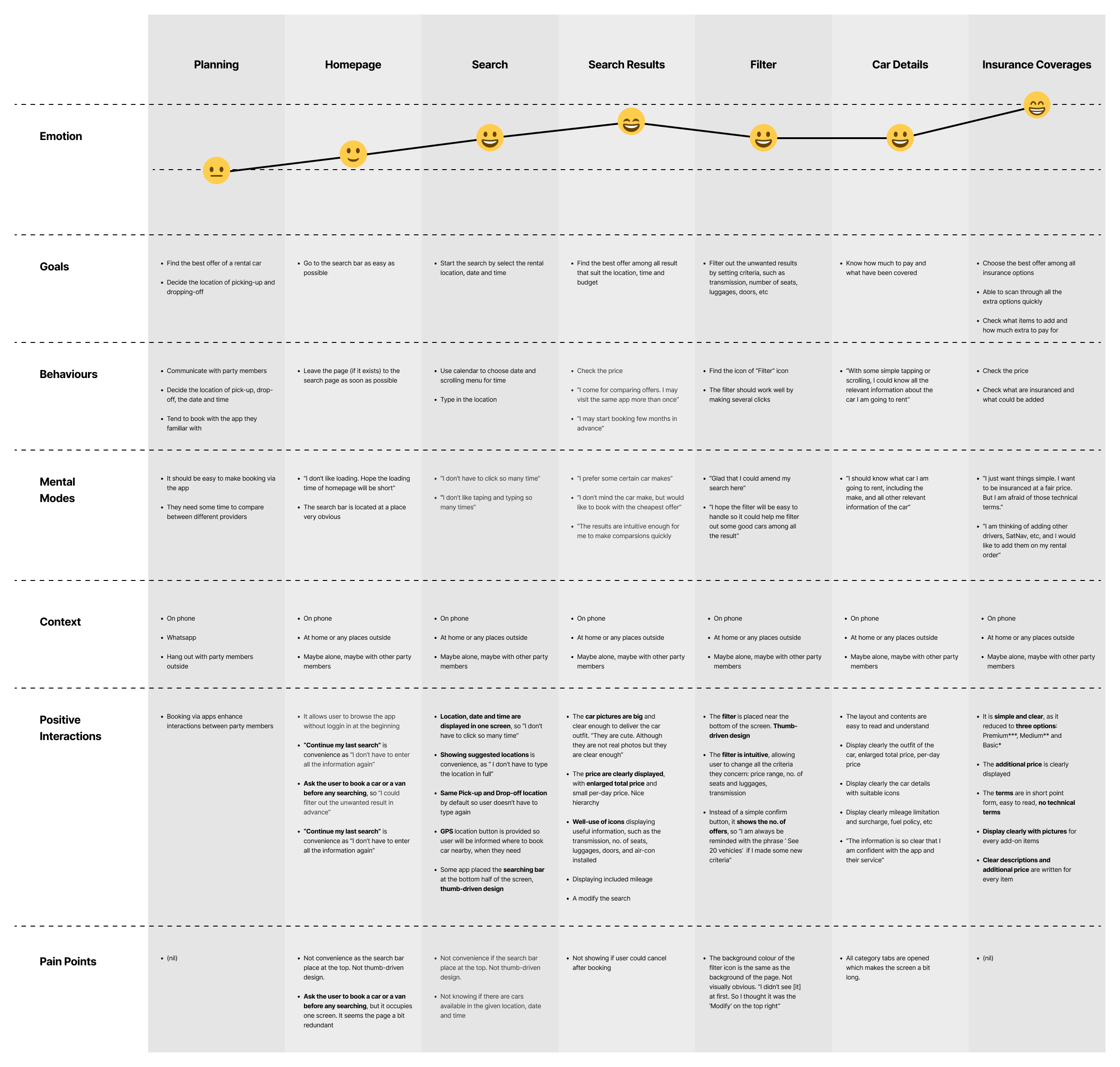
To gain insights on what features or layout to follow and avoid, I analysed the app “Eurocar” and constructed a user journey. The app was evaluated based on the emotions it evoked in users throughout the process.
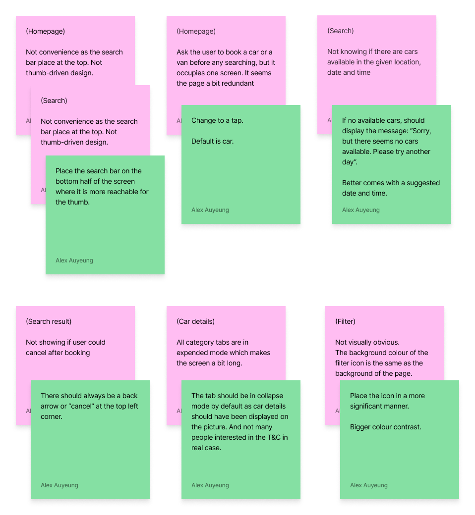
By identifying pain points (highlighted in pink) and proposing solutions (highlighted in green), I aimed to create a design that would lead to more satisfying user experiences.
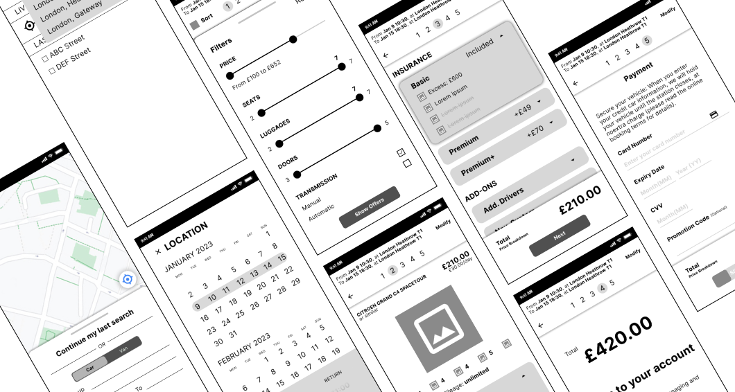
HIGH-FIDELITY WIREFRAME
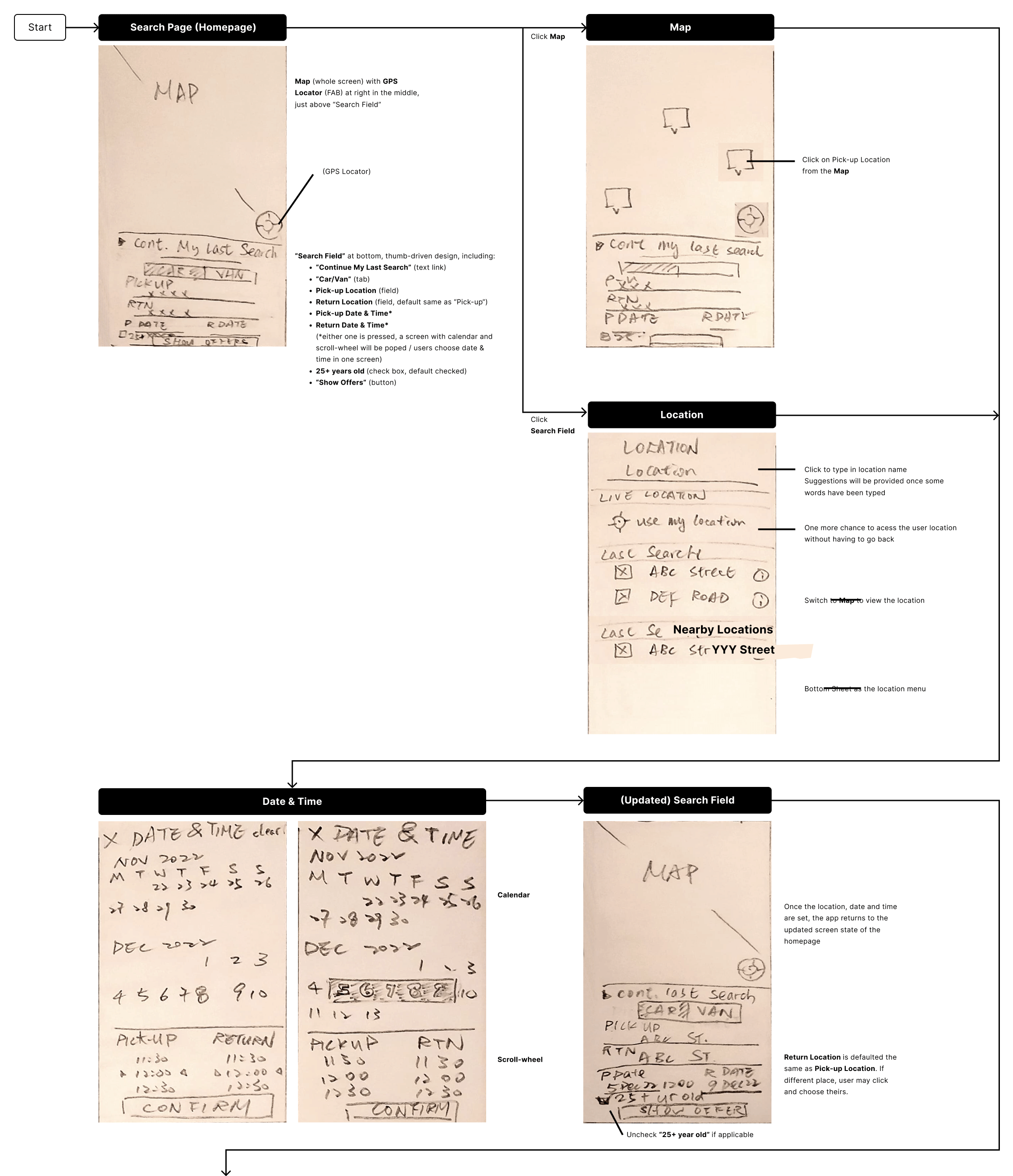
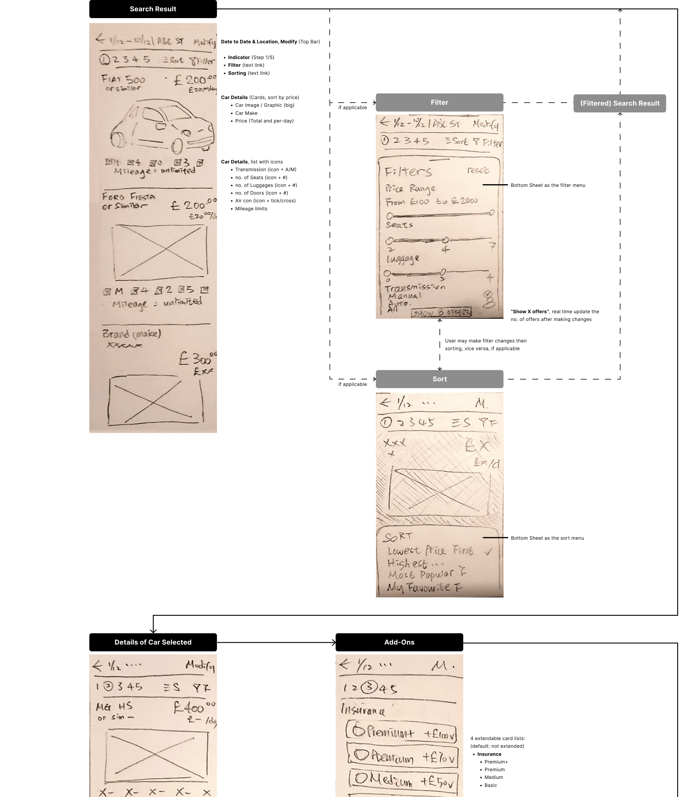
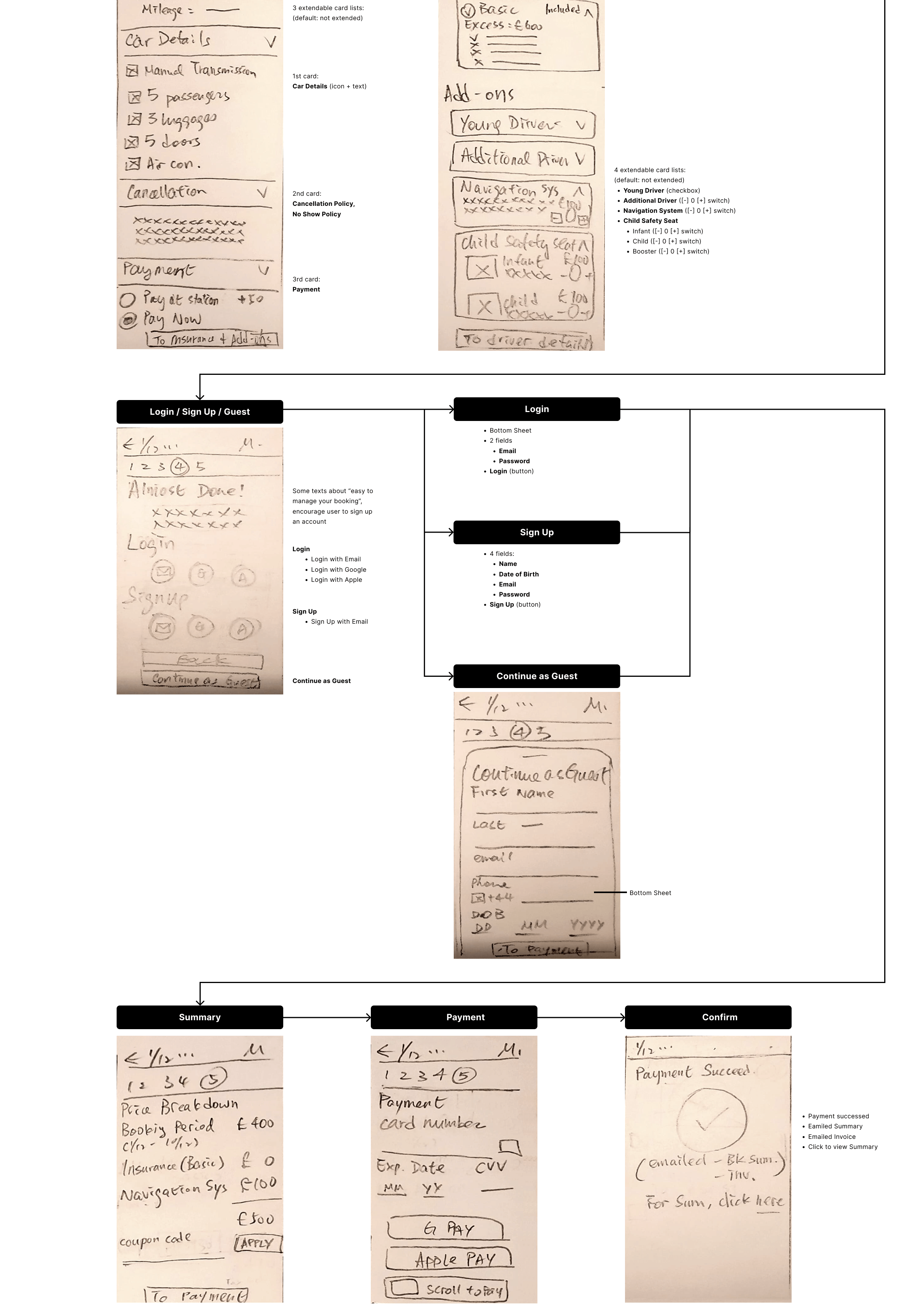
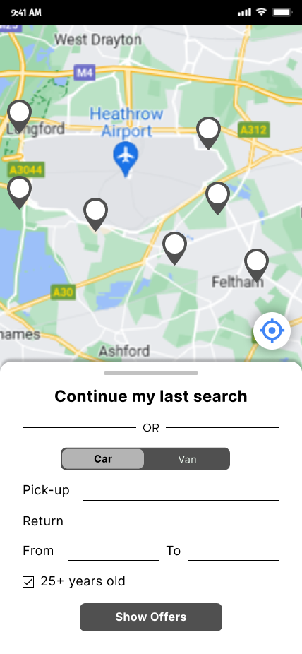
With minor amendments, I then created a high-fidelity wireframe and the prototype.
Home Screen
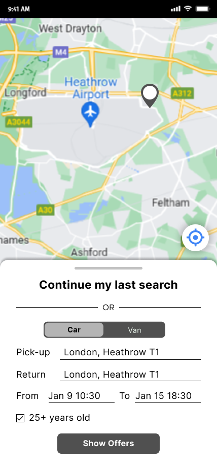
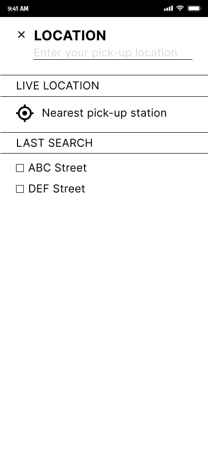
Search for Location
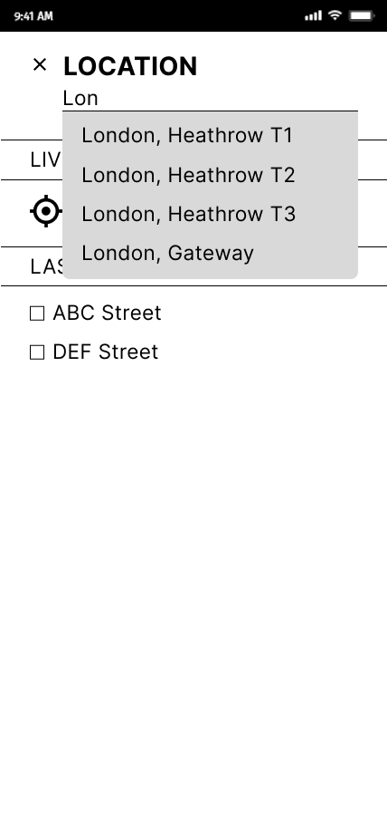
Date & Time
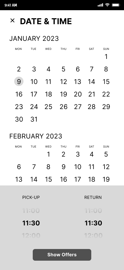
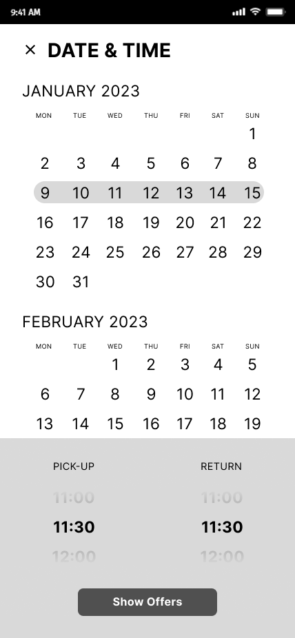
Search Result
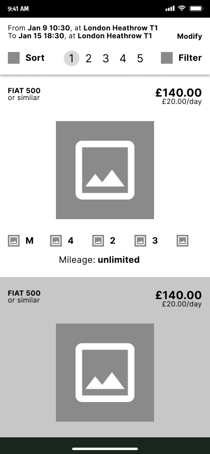
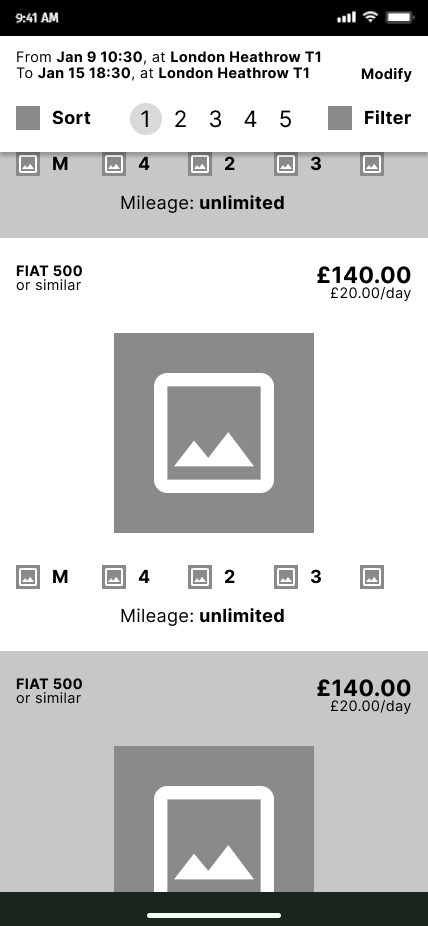
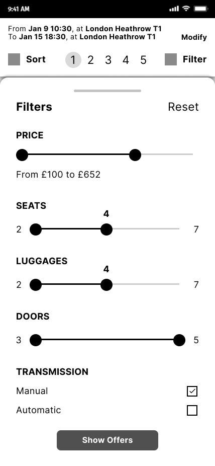
Filters
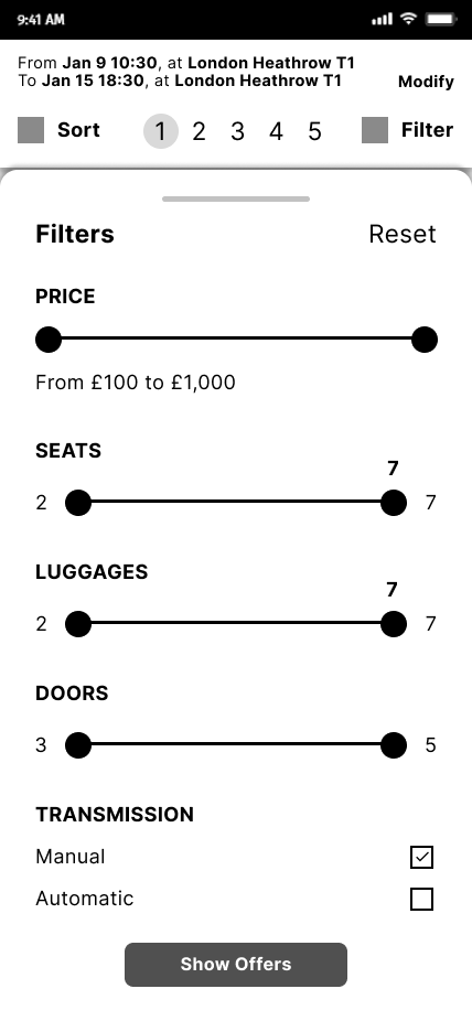
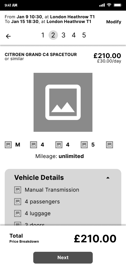
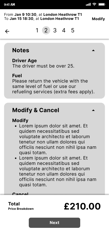
Car Details
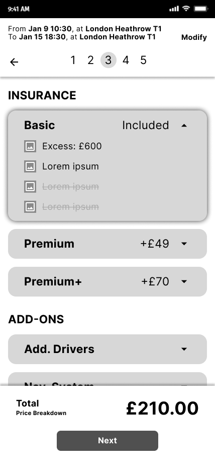
Insurance
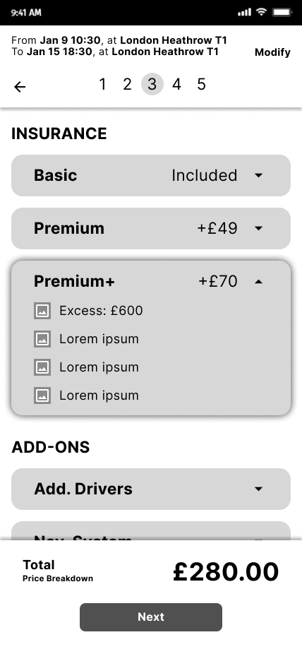
Add-ons
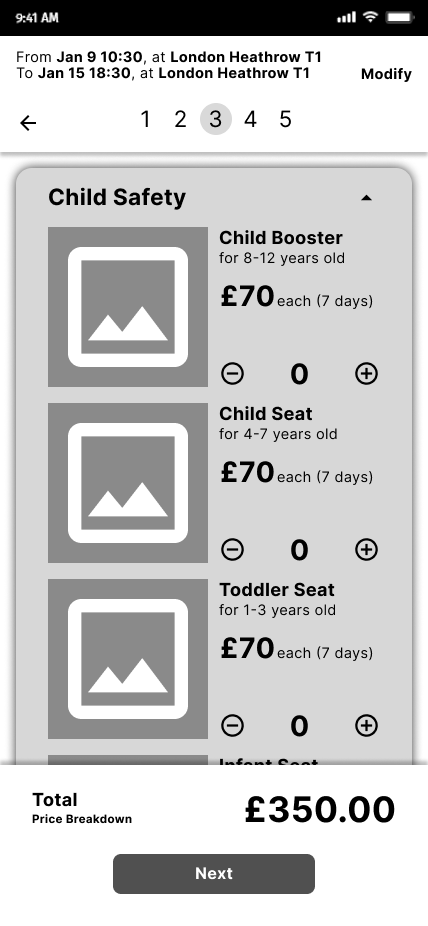

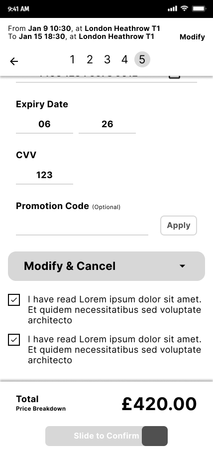
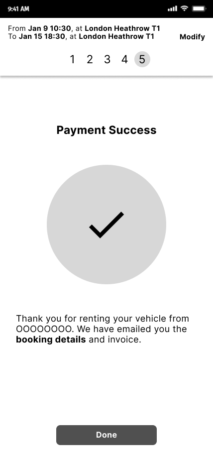
Payment #1
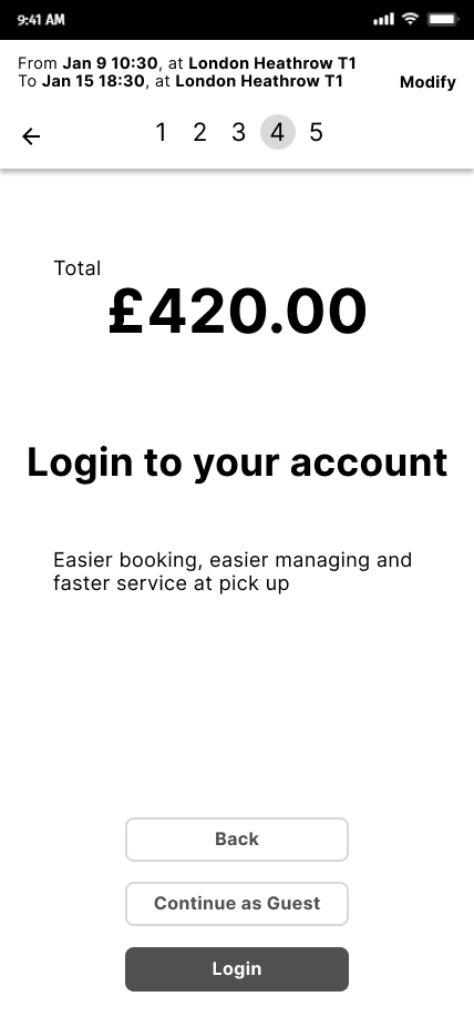
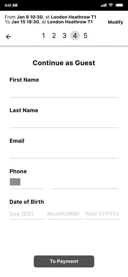
Payment #2
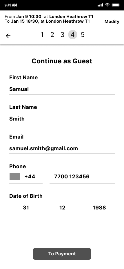

Payment #3
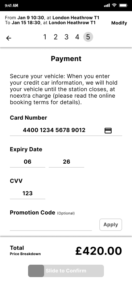
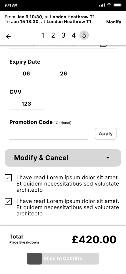
Payment #4
