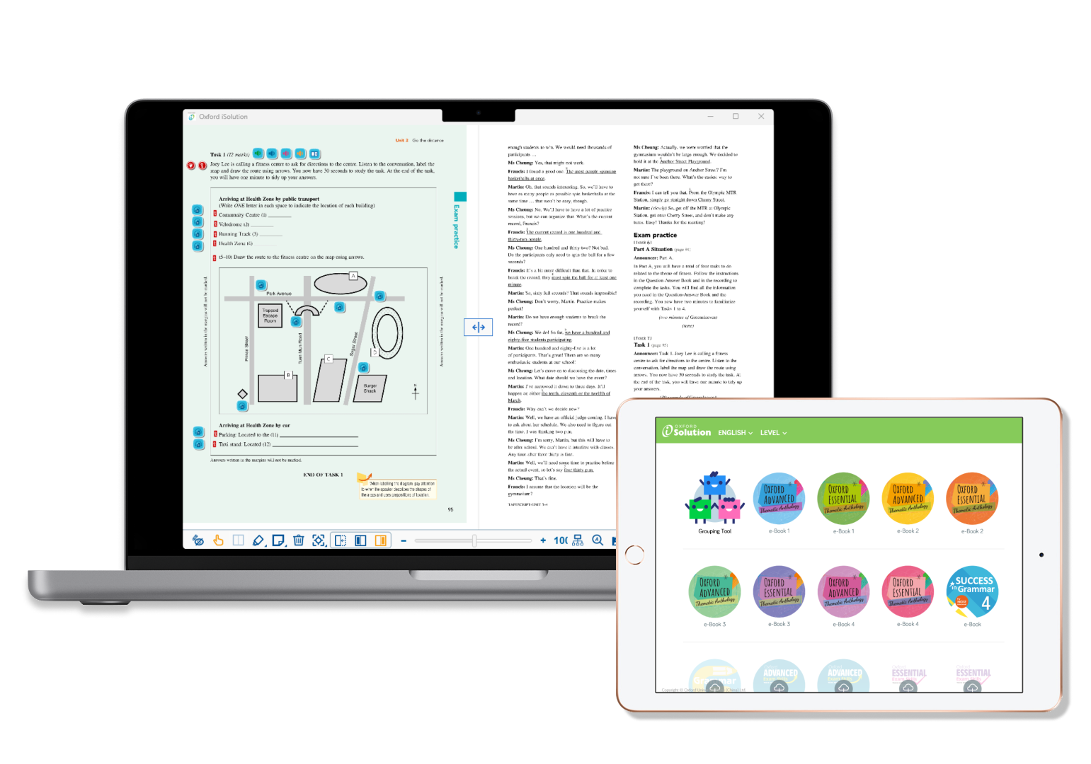
Oxford iSolution
My experience at Oxford
CONTEXT
“Oxford iSolution” is a digital platform for teachers by Oxford University Press. It has been introduced in the Hong Kong school market, in response to “The Fourth Strategy on IT in Education (ITE4)” implemented in 2015 by the Education Bureau of Hong Kong, to provide enhanced quality of e-learning resources in primary and secondary schools.
By 2017, over 1000 (95%) schools have equipped with enhanced IT infrastructure. Each teacher was provided with a personal device and a minimum of 300 devices per school were made available for students to share.
“Oxford iSolution” is a e-learning platform that supports PC, Mac, iOS, and Android. It is designed to help teachers with their lessons with the integrated new and existing teaching resources, including but not limited to Oxford e-coursebooks, video clips, animations, games, VR simulations, AR simulations, interactive exercises, quizzes, and worksheets.
This is the story of how I encountered the field of User Experience.
note: This case study is a interpretation of my experience working on Oxford iSolution (PC version). Some records are omitted.
MY ROLE

As an Account Manager, my responsibilities were to discover user needs, deliver and test the optimised products, and promote the products: “Oxford iSolution” and Oxford coursebooks. I gathered feedbacks and comments from users (teachers) through site visits, and workshops. After analysing the data and research findings, I collaborated with a cross-disciplinary teams to help optimising the products: by sharing the findings and conducting usability tests when prototypes were available. I also responsible for delivering and promoting the products, and provide after-sales service to my users.
MY CLIENTS (TEACHERS)
While “Oxford iSolution” was first released, teachers were not that satisfied at first. Some teachers expressed their concerns on the app’s usability, interface and technical difficulties. Some preferred the old way and asked for CDs or DVDs instead.
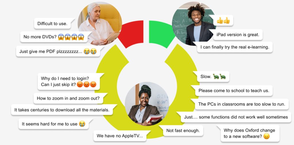
A few teachers demonstrated proficiency with innovative apps and platforms, but the majority (80%) expressed their worries on adequately adapting the changes.
Among these 80% of teachers, they generally faced difficulties in fully utilising the platform due to their habits or preferences, and the absence of necessary IT infrastructures at schools.
Their traits could be fictionalised as Ms Wong as follows:
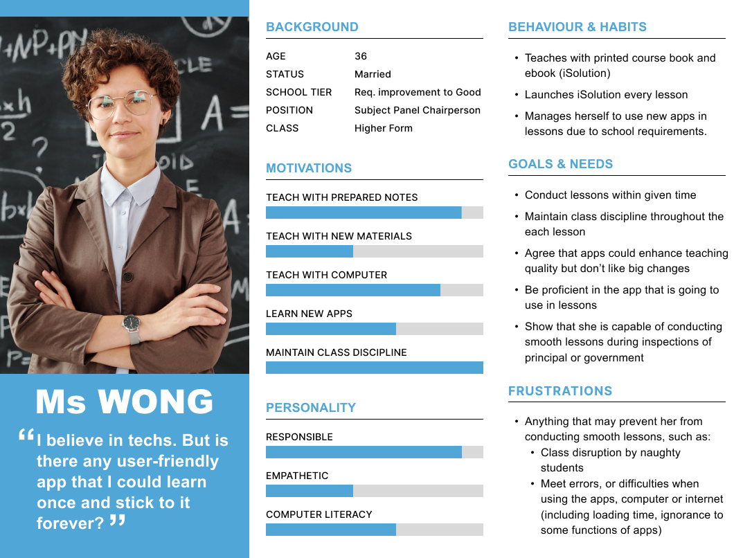
In most cases, teachers played the passive roles. They were asked to incorporate more “e-learning elements” into their classes as a result of school policies which aimed at promoting e-learning and utilising the IT infrastructures invested.
CLIENTS’ JOURNEY
During the first few years, apart from holding workshops to help teacher familiarise themselves with the app, we also conducted tests to gather teacher feedback on their pain points and to identify potential opportunities for further optimisations.
The following map shows a reconstructed, simplified typical user journey for Ms Wong.
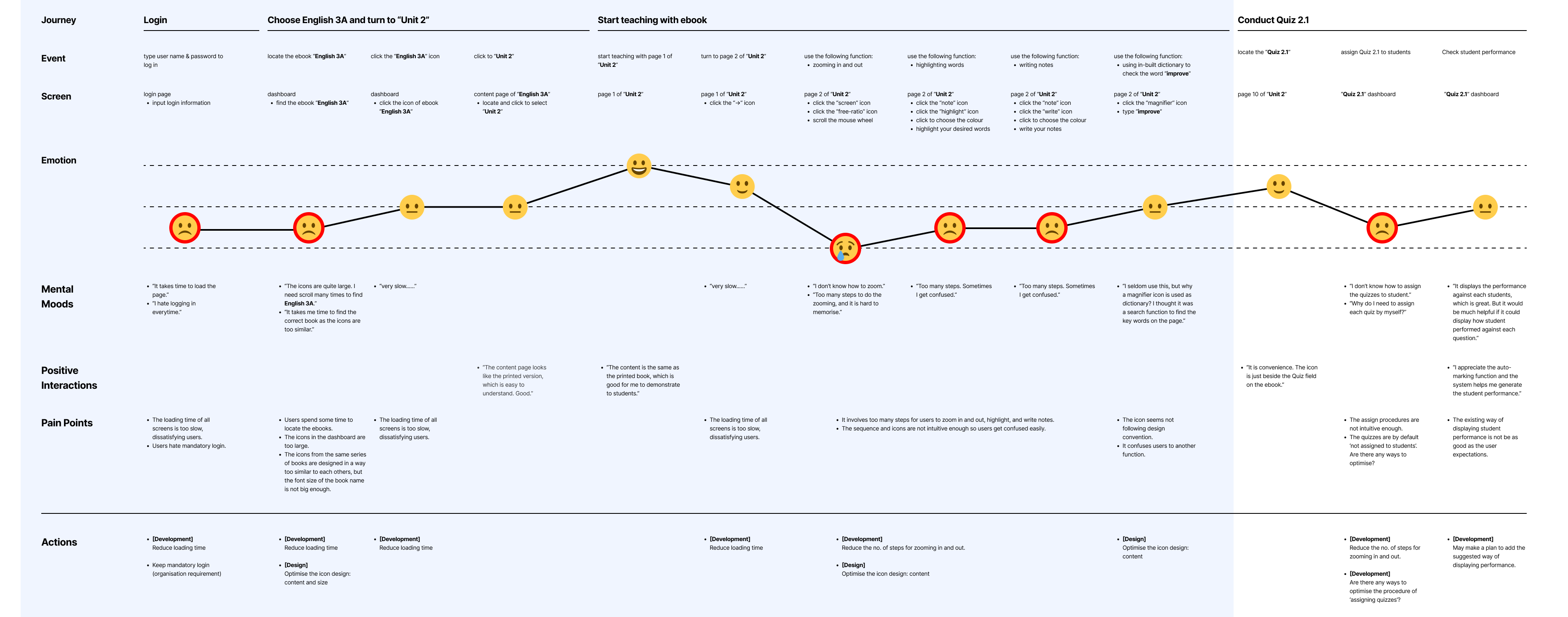
During my time at Oxford, the sections that highlighted in blue were the most frequently used functions, representing the process from logging in all the way to displaying the e-books.
By the time I left Oxford, some optimisation updates on these sections have gone live.
Yet, as the section that involves assigning quizzes was rarely used, the optimisation works have been paused.
ISSUES FOUND
With reference from the user journey map, teachers generally were not satisfied with the following issues:

Mandatory Login
▼ View

Long Loading Time
▼ View
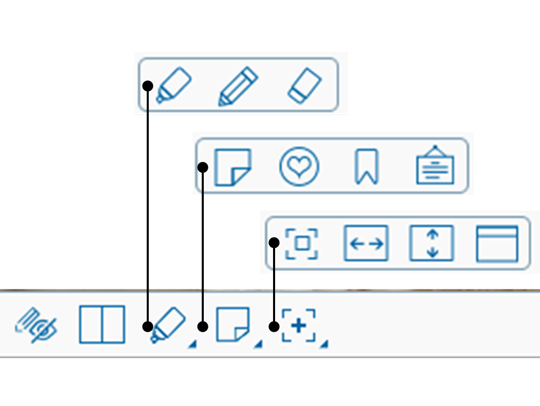
Confusing Toolbar
▼ View
Complex
Procedures
(updating)
▼ View
Mandatory Login on a single device

Issue
Due to security concerns, Oxford required teachers to log in on a single device every time when launching “Oxford iSolution“. In event of a second login, the first device would be automatically logged out. This was to prevent unauthorised access to downloadable teaching resources (worksheets, PowerPoints, answers of exercises, etc.) from any parties except teachers.
Tackle
As part of the company policy to prevent file leakage, we were tasked with persuading teachers to understand the importance of mandatory login. Additionally, we aimed to secretly identify their needs and assess any updates required for those who were dissatisfied.
- “I often forget usernames and passwords.” (50%)
[Importance: 3/5, user satisfaction, may be exaggerated] - “I feel nervous when I have to check the login details when I forget them.” (40%)
[Importance: 2/5, user satisfaction, may be exaggerated] - “Every second counts, it just takes extra time to go through the login progress.” (80%)
[Importance: 4/5, user satisfaction] - “It would be much better if we were allowed to multi-login.” (50%)
[Importance: 1/5, user satisfaction, good-to-have functions] - “I find it OK to log in every time.” (10%)
[some teachers were not upset with mandatory login]
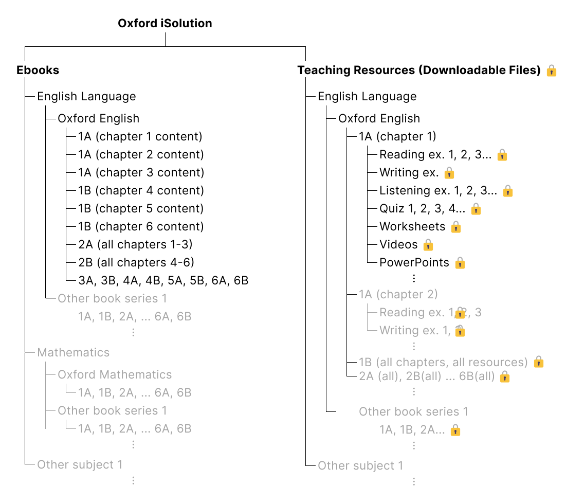
As depicted in the left picture, all the contents in “Oxford iSolution” can be categorised into “Ebooks” and “Teaching Resources.”
Due to the inherent nature of ebooks, their contents have been integrated into the app and were not available for download.
However, the contents in “Teaching Resources” consisted of word files, PowerPoints, and answers to exercises. These files were downloadable and subject to password protection.
| Original Situation | Action Proposed | Expected Outcome |
|---|---|---|
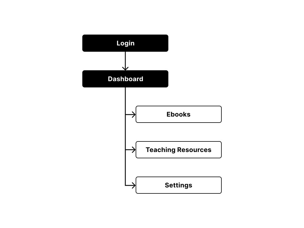
| To prevent file leakage, login is set to be mandatory to access to e-books and other resources. | Add a function “Saved Login”. Once checked, user will be redirected to the dashboard next time. They can then access to the e-book but not the resources. | Save users’ time |
Solution
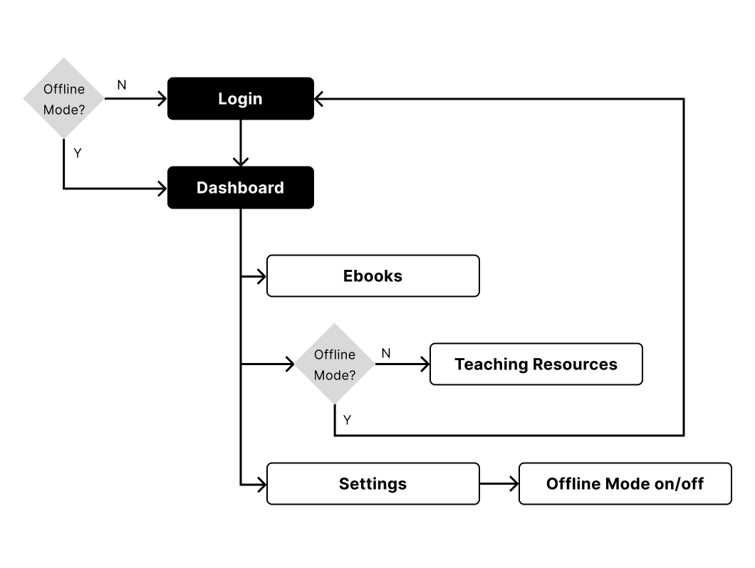
After confirming that most teachers consistently displayed the ebook contents every day while only a small number frequently downloaded files, we decided to introduce a new feature called “Offline Mode.” This feature enabled teachers to “lock” their accounts to specific devices, allowing them to access the ebook contents without the need to log in again next time.
However, it’s important to note that under “Offline Mode,” access to teaching resources and logging in on other devices were restricted.
Follow up
As Oxford recommended teachers to login, the “Offline Mode” was quiet disregarded. Under such circumstance, we were asked to notify the new features to those unsatisfied teachers. While most teachers were not aware of it, those who found the features commented the name (“Offline Mode”) confusing and some even locked themselves unintentionally.
▲ Back
Long Loading Time

Issue
The slow loading time of the content often caused frustration among teachers, as every second was crucial in the classroom setting. The longer the loading time, the higher the chance that disruptive students could take control of the class.
- “The app is slow. Too many loadings. Annoying.” (80%)
[Importance: 5/5, user satisfaction] - “Waste my time.” (40%)
[Importance: 4/5, user satisfaction] - “If the app takes so much time, the class may out of control.” (80%)
[Importance: 5/5, user satisfaction]
Tackle
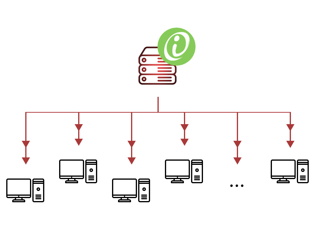
We discovered that schools had installed “Oxford iSolution” on their school servers, rather than on the classroom PCs.
While this one-for-all installation approach was convenience, the performance was affected, as the loading speed was heavily reliant on the connection speed. The more teachers accessed the server simultaneously, the more pronounced the issue became.
Solution
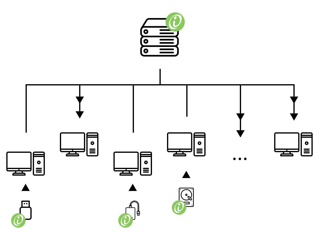
In the short term, we suggested that teachers copy the app to the PCs in the classrooms or portable hard disks, so that the app could be launched via local connections.
Follow up
However, due to the huge file size, saving all teaching resources on every PC was hardly possible, while streaming on cloud when use required reliable connections. In the long term, we suggested that the development team should work on reducing the app’s size to address this issue.
▲ Back
Confusing Toolbar

The icons with ambiguous meaning and unintuitive step quite often confused teachers. Some teachers were unable to zoom in and out, scroll horizontally.
BENCHMARK
- The icons should be intuitive at first sight.
- The toolbar’s responded should be predictable.
- The number of clicks and that of steps should be minimised as much as possible.
- A clear indicator that shows the screen’s state is necessary.
Zooming In or Out
Issue
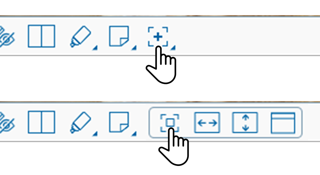
Teachers had to click two ambiguous icons in succession to zoom in or out. This was difficult to understand and led to confusion.
- “I don’t even know there was a zooming function!” (40%)
[Importance: 5/5, basic functionality] - “I saw you could zoom last time, but I can’t make it myself..” (20%)
[Importance: 5/5, basic functionality] - “I forgot how to zoom.” (10%)
[Importance: 5/5, basic functionality] - “Icons are unintuitive. I don’t see their meaning.” (50%)
[Importance: 4/5, UI elements that affects basic functionality]

Solution
We suggested replacing the icons with a slider, which had several benefits. This change prevented changing “modes,” reduced the number of clicks needed, and was more intuitive and easier to adjust than using the mouse wheel.
Horizontal Scrolling
Issue
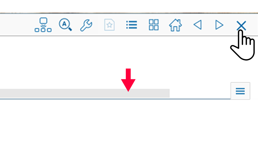
Some teachers found it difficult to scroll horizontally because the scrolling bar was covered by the toolbar, and an ambiguous icon was required to uncover it.
- “I was about to ask why there is no horizontal scrolling.” (60%)
[Importance: 5/5, basic functionality] - “I have to re-zooming all the time to get to my designating contents.” (20%)
[Importance: 5/5, basic functionality, user satisfaction] - “The toolbar should not cover the scrolling bar. What a design!” (30%)
[Importance: 5/5, user satisfaction]
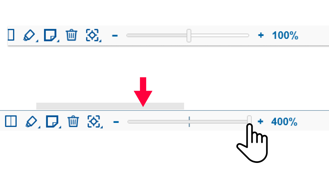
Solution
We recommended moving the scrolling bar above the toolbar, eliminating the need for extra clicks.
Highlighting
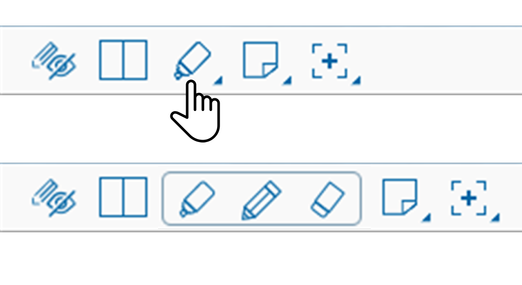
Issue
Teachers were having trouble distinguishing between the two screen states, “scrolling mode” and “highlighting mode,” leading to accidental actions such as drawing a line while trying to scroll.
- “I was about to ask why there is no horizontal scrolling.” (60%)
[Importance: 5/5, basic functionality] - “I have to re-zooming all the time to get to my designating contents.” (20%)
[Importance: 5/5, basic functionality, user satisfaction] - “The toolbar should not cover the scrolling bar. What a design!” (30%)
[Importance: 5/5, user satisfaction]
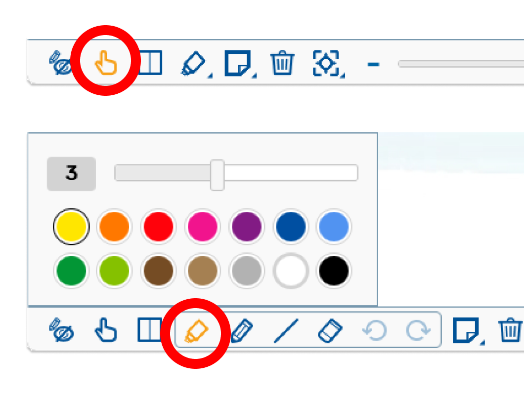
Solution
To address this, we suggested making the current screen state more visible to the user, such as bolding the corresponding icon when the screen is in a certain mode (e.g. “highlighting mode”).
Follow up
Unfortunately, I was unable to conduct any follow-up work on the updates as they were implemented after my departure from the company.
▲ Back
REFLECTIONS
This is the story of how I discovered the field of User Experience. I was unaware that my daily work of exploring client needs was actually a part of UX until I took UX courses and learned about conducting user research.
As an Account Manager, I often found myself in a difficult position. While I was trained to persuade clients to accept the imperfections in the product, it didn’t sit well with me. I couldn’t help but feel sorry for my clients and wished I could offer them a better solution.
This feeling was compounded by my growing interest in UX design. I became increasingly passionate about creating products that truly meet the needs of users and provide them with the satisfaction they deserve. And so, I made the decision to pursue a career in UX, driven by the desire to design products that truly make a difference in people’s lives.