PARKING
A Responsive Web App
showcasing real-time occupancy and pricing information
CONTEXT
Parking in Hong Kong poses significant challenges for drivers. The car parks and meters are either often fully occupied, or the fees are charged at a level beyond drivers’ expectations, leaving drivers struggling to find available and affordable parking slots or resorting to illegal parking. I remembered the time when I was an Account Executive, finding a parking slots near my clients’ site has often been a struggling task.
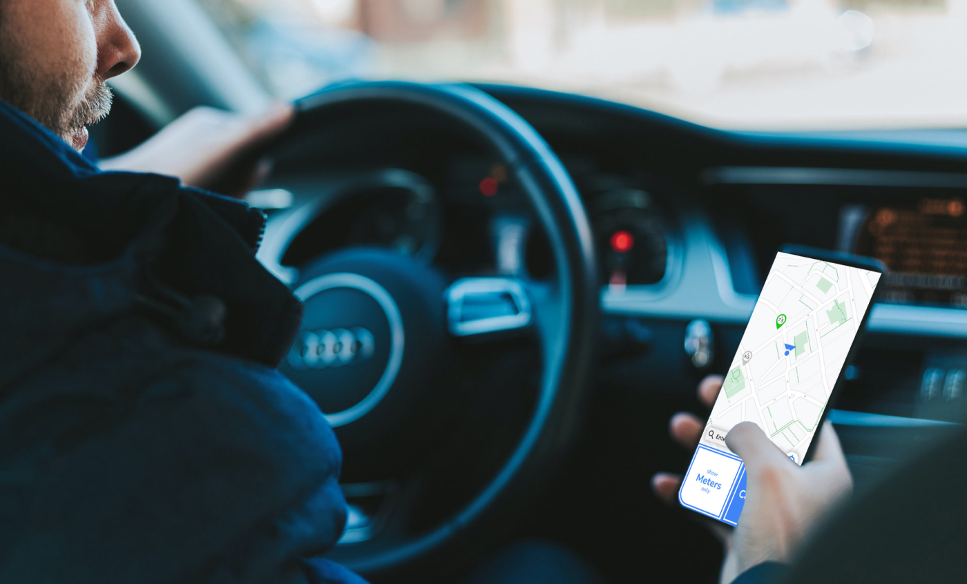
There was no specific parking app for drivers in Hong Kong. They relied solely on Google Maps to be navigated for the parking space, without being informed the real-time occupancy and the fees. So I would like to take this opportunity to build an app that could help driver park.
MY ROLE
In this project, my responsibilities included user interviewing, analysing data, creating designs from scratch, and developing low-to-high-fidelity prototypes using clickable wireframes with pixel-perfect accuracy.
Tools used: Bandicam, Zoom, MS Word, Figma
Duration: Mar 2022 – Jul 2022 (5 months)
Role: Researcher, UX Designer, UI Designer
USER INTERVIEWS
To identify the pain points and concerns of finding parking slots in the city, I conducted targeted interviews with six candidates. From these interviews, I extracted the six most relevant questions that helped me to gain a better understanding of the user’s perspective on the issue.
The questions and findings are as follows:
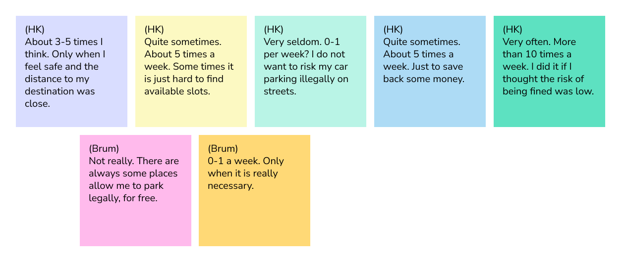
Q. How do you find available parking slots? Could you please describe it?
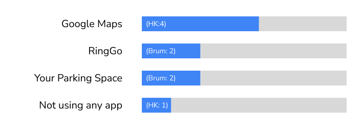
- 4 out of 5 candidates from Hong Kong use Google Map
- All 2 candidates from Birmingham use RingGo and Your Parking Space
- 1 candidate from Hong Kong does not use any app.
He does not familiar with apps and prefer arriving destination earlier to find car parks.
Q. Among car parks, meters, and illegal street parking, what is your preference?
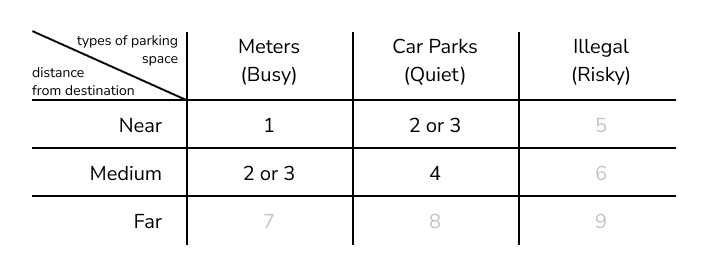
** 1 is the most preferred
** Drivers may take risk to park illegally to pay or walk less
Q. How long do you usually take to find available parking slots (in car parks and at the meters)?

Q. Could you describe the process you find a car park?
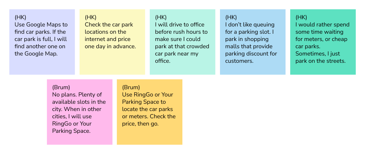
Due to the high demand and congestion of affordable car parks in Hong Kong, candidates in Hong Kong tend to prepare more extensively compared to those in Birmingham. This includes checking for alternative parking options, researching prices in advance, arriving earlier, queuing, or taking advantage of discounts by parking in shopping mall car parks and shopping there. In contrast, those living in Birmingham have plenty of parking slots available, and therefore, they do not need to make such preparations.
Q. What are the frustrations when you are finding parking slots? Could you describe the experience?
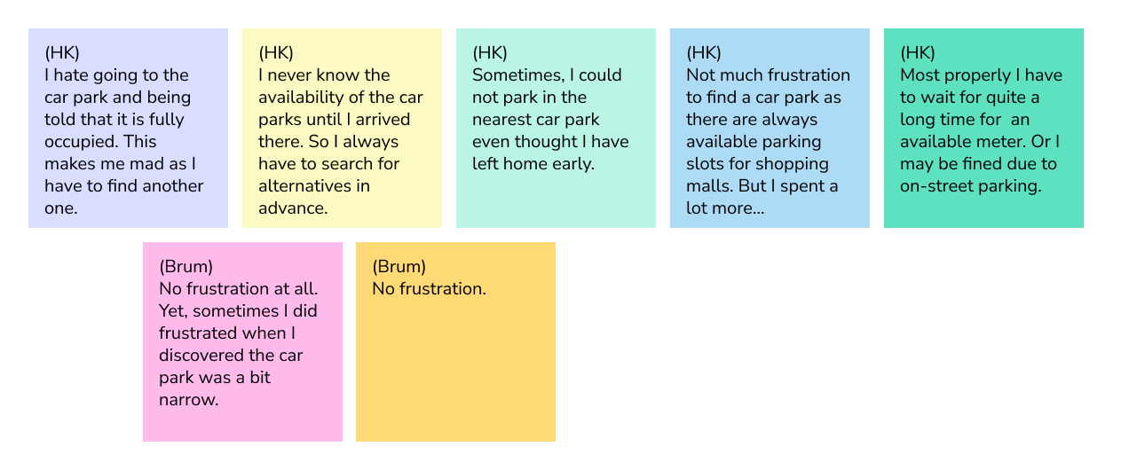
Most of my candidates were frustrated when they arrived at the car parks or meters and discovered that there were no available slots, while one candidate may have been unaffected as she spent extra money parking in shopping malls. But in general, the cause of their frustration was the lack of real-time information on the availability of parking spots. If they are well-informed, their parking experience could be much better.
DRIVERS’ PERSPECTIVES
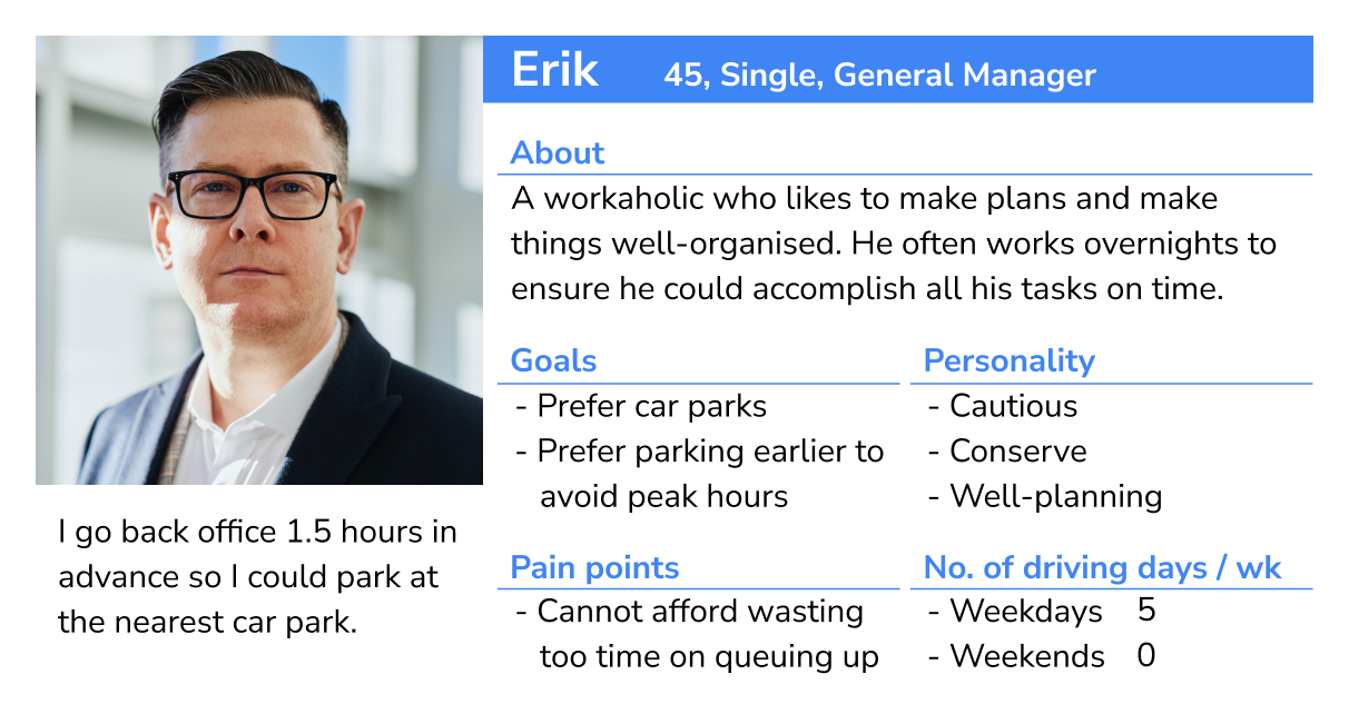
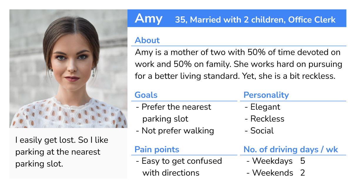
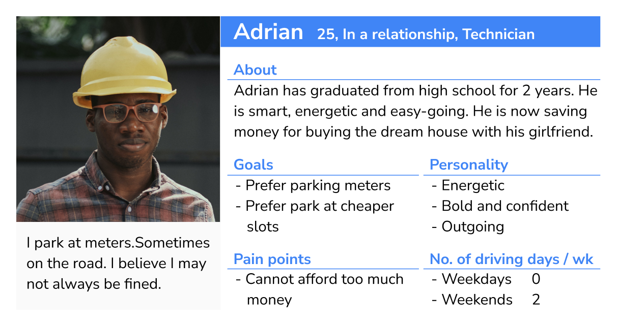
After gaining a deeper understanding of potential users through the interviews, I developed User Personas based on the analysis and summary of the interviews.
IDEATE & DESIGN (initial)
DEFINING USER GOALS
With the three users (Erik, Amy and Adrian) in mind, I began defining their user stories to guide the development of my parking app.
As a person who commute by car…
- I want to know the real time availability of parking slots, so I don’t have to spend time to plan where I should park.
- I want to know how much the car park or meters cost, so I can know compare between different parking slots.
- when I am driving, I can hardly touch the phone to check the details.
- I want an app that is simple, intuitive and familiar to me. I don’t want to spend time on learning a new app.
A RESPONSIVE WEB APP
With the user goals that shaped the core values of my app:
- Well-integrated information (real-time occupancy and fees)
- Simple structure
- Intuitive UI elements
I intended to design the app as a responsive web app. Form the user perspective, this could fit with most devices with all sizes.
APP BENCHMARK(initial)
It is obvious that the majority of my users will be individuals who are driving. They are busy and in need of real-time parking information in a quick and efficient manner, so my app should be designed in the following way:
- able to use in car
- simple, clear and intuitive
- big buttons
- thumb-driven design
- super easy in-app navigation
- instant real time data
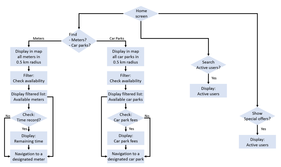
USER FLOW (initial)
After taking the aforementioned benchmark into consideration, I began designing the the app’s user flow. Yet, this version was subsequently refined based on the results of a usability test.
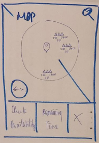
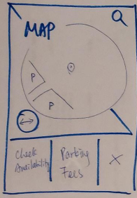
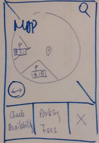
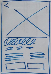
LOW-FIDELITY WIREFRAMES (initial)
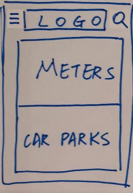
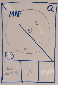
The low-fidelity wireframes were created based on the user flow that had been designed.
TEST ON USER FLOW AND WIREFRAMES (initial)
Next, I conducted four usability tests on the user flow and the wireframes. I organised all screen states into three categories: home screen, map screen, and market. Positive and negative comments were distinguished by the use of black and red text colours, respectively.
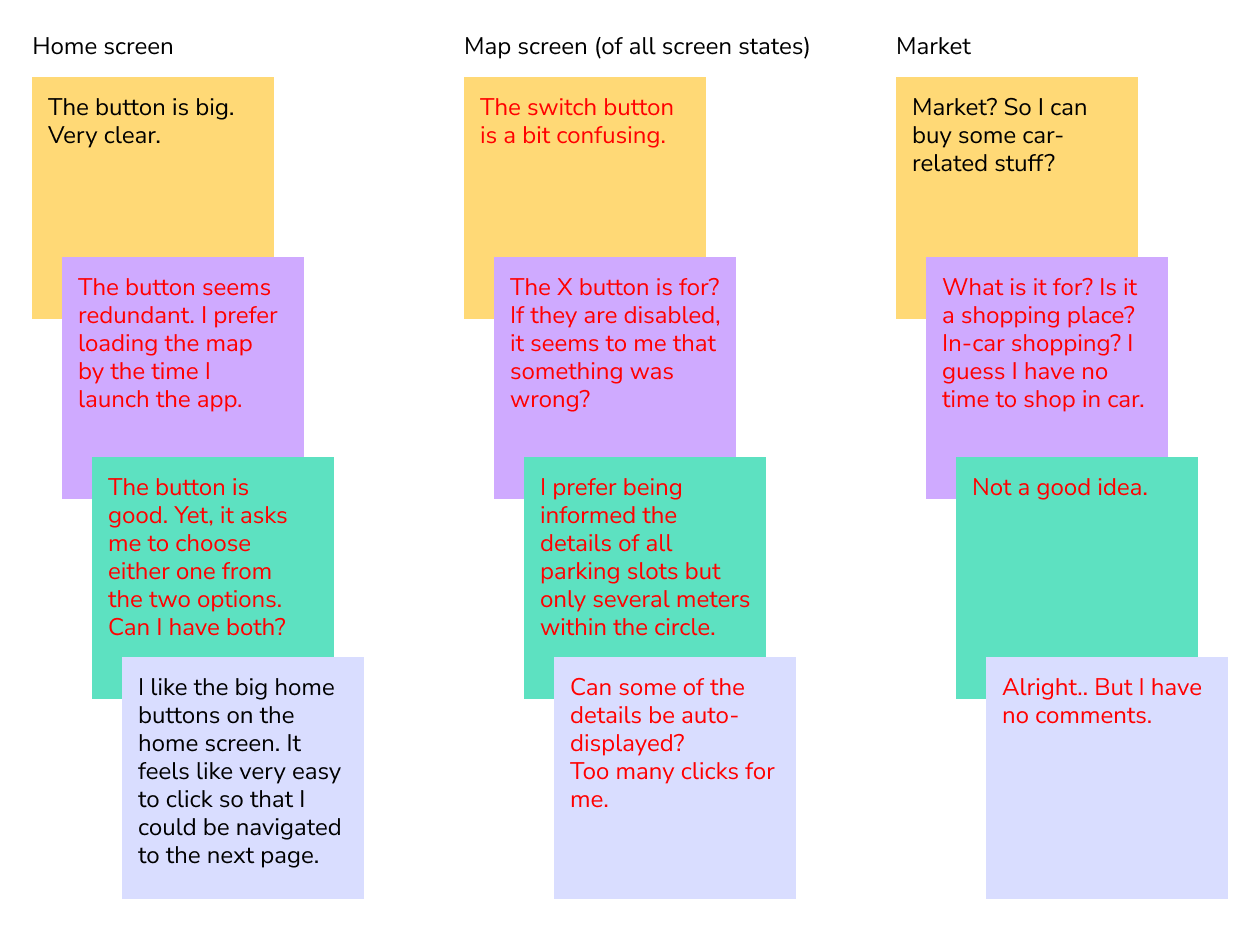
After conducting the usability tests, I identified the shortcomings in my initial user flow and wireframes, as well as the areas that required improvement for optimal performance of my app. More, I realised that my assumptions on what would be best for the users were not always accurate. Fortunately, since it was in the early stages, I encountered minimal obstacles in refining my flow and wireframes.
Points to note:
- home – remove the button to reduce the number of screens and clicks
- map – set to be the new home screen
- map – redesign certain buttons to avoid user confusion
- map – display all meters and car parks simultaneously
- map – display sufficient details on the screen simultaneously
- market – remove the screen
IDEATE & DESIGN (refined)
APP BENCHMARK (refined)
Additional benchmark should be added to the current one.
- able to use in car
- simple, clear and intuitive
- big buttons
- thumb-driven design
- super easy in-app navigation
- instant real time data
- remove unnecessary buttons
- minimise the number of screens and clicks
- display sufficient details on the screen simultaneously
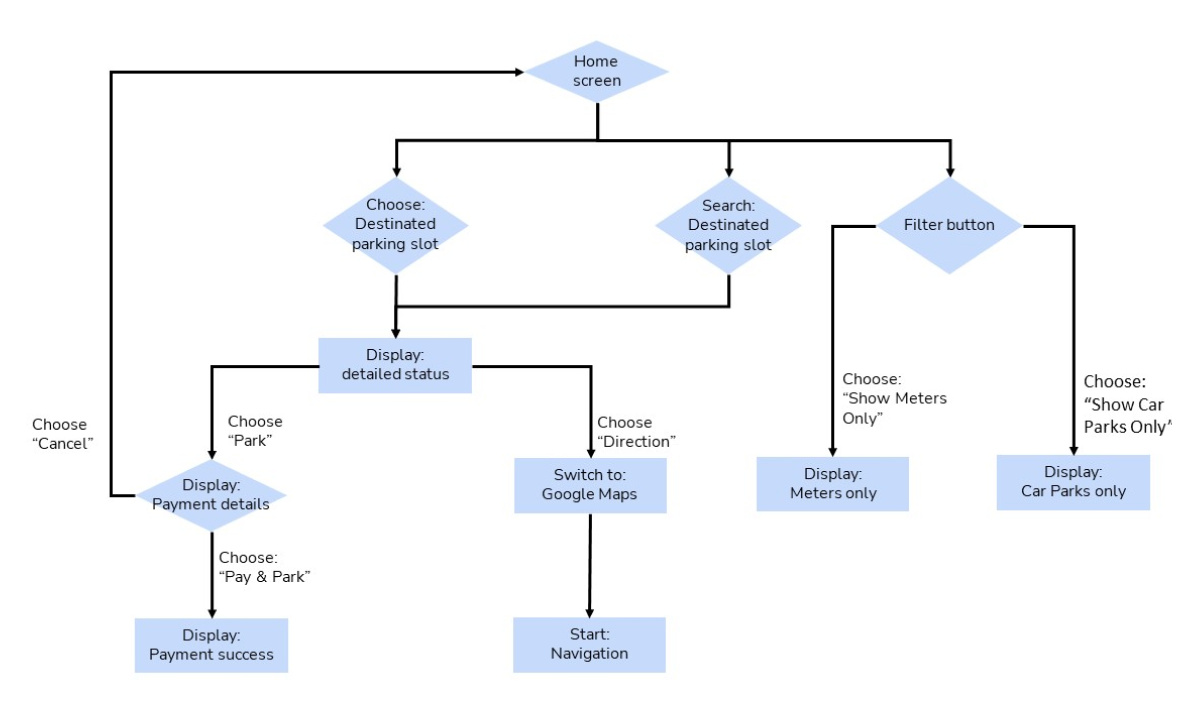
USER FLOW (refined)
With new benchmark considered, a much-refined user flow was designed.
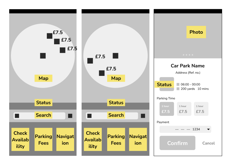
MID-FIDELITY WIREFRAMES (refined with test results)
After considering the feedback from the usability tests, I moved on from the low-fidelity wireframes and began designing mid-fidelity wireframes.
TEST ON UI OF HOME SCREEN
I conducted a brief UI survey to determine the optimal placement of the primary action button.
How do you hold your phone?

Which design do you prefer if you are holding your phone in the following way?
(I assume that the left hand is a resemblance of phone holder.)
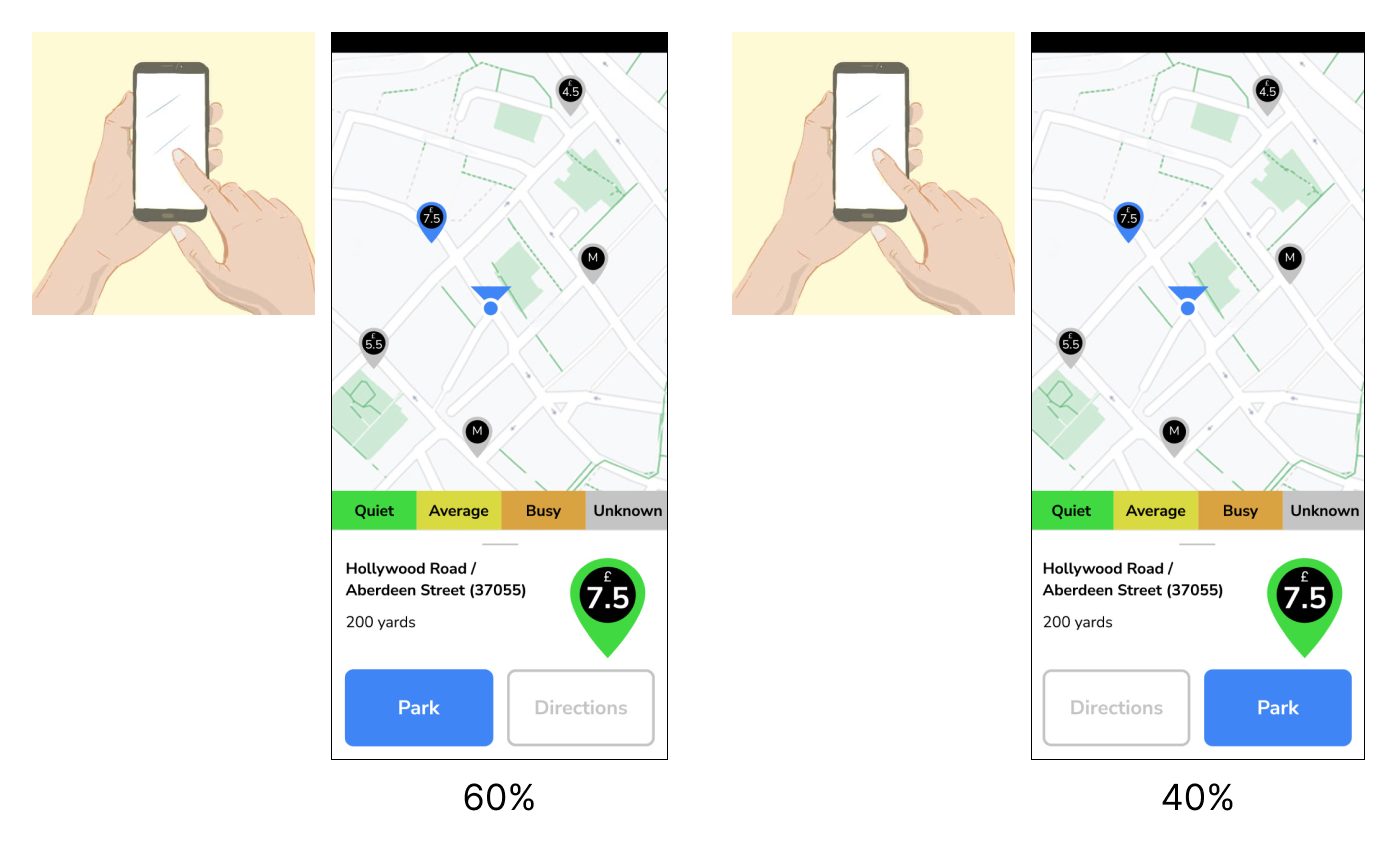
The majority of people preferred the primary action button on the left as it aligned with their reading habit from left to right. Therefore, I decided to go with the first design.
IDEATE & DESIGN (3rd version)
HIGH-FIDELITY WIREFRAMES (3rd version)
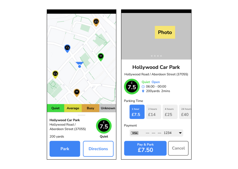
The high-fidelity wireframes were designed based on the results from the previous survey.
TEST ON USER FLOW AND WIREFRAMES (3rd version)
To test my wireframes and user flow, I conducted five quick tests. Positive comments were displayed in black text, while constructive comments were displayed in red text.
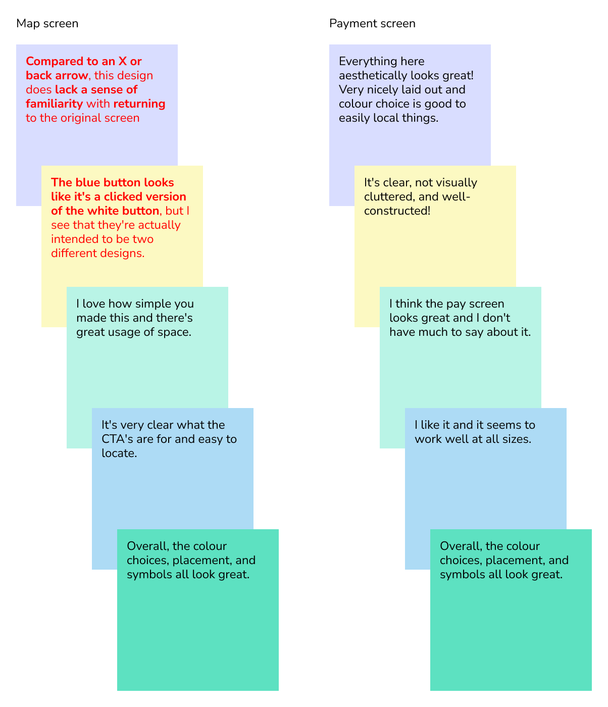
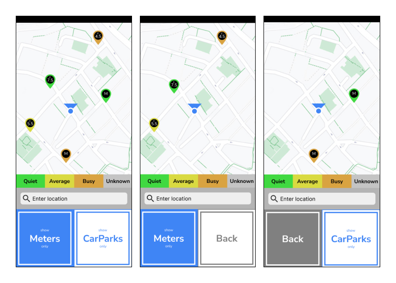
Two feedbacks pointed out that the main button was not intuitive enough to indicate the screen states. One of the feedbacks suggested that “the blue button looks like it’s a clicked version of a white button,” which inspired me to refine my design again.
Default screen state (display both meters and car parks)

When the left button is clicked (display meters only)

When the right button is clicked (display car parks only)

The original design that utilised three colours – blue (primary action), white (secondary action), and grey (reverse action) – was revised to only use two colours: blue (as a highlighted state indicating an action has been performed) and white (for normal state).
IDEATE & DESIGN (Tablets and PCs)
WIREFRAMES (Tablets and PCs)
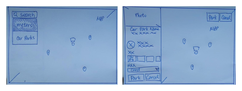
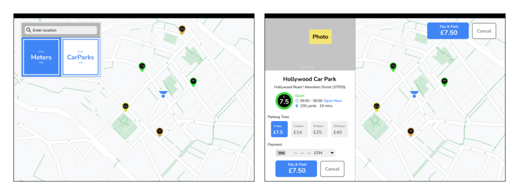
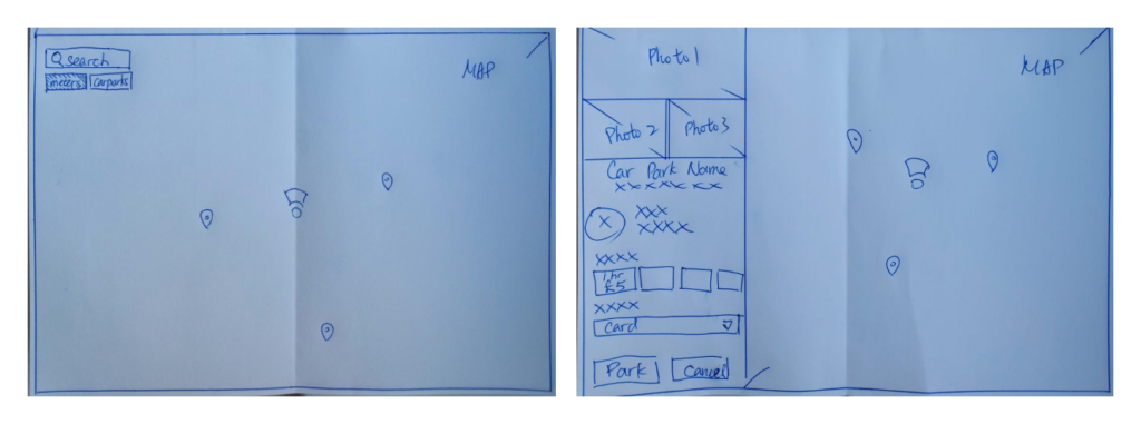
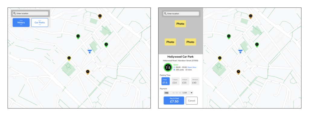
Based on the results from previous surveys, I then designed the low- and high-fidelity wireframes of tablet version and PC version.
IDEATE & DESIGN (Tablets and PCs)
WIREFRAMES (Tablets and PCs)
Based on the results from previous surveys, I then designed the low- and high-fidelity wireframes of tablet version and PC version.


FINAL UX DESIGN
Home screen: Instant real-time data
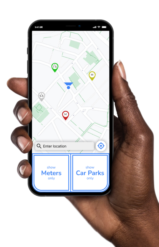
The real-time data of all nearby parking slots are instantly displayed on the home screen, right after the app is launched. No further action required.
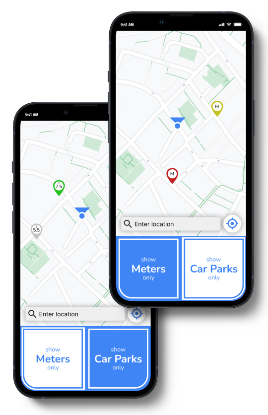
One-click filter: Thumb-driven design
The app employs a thumb-driven design, with all action buttons placed at the bottom.
Switching between 3 modes – “Show all”, “Meters only”, and “Car parks only” – can be done with a single click.
This allows users to easily concentrate on the traffic while using the app.
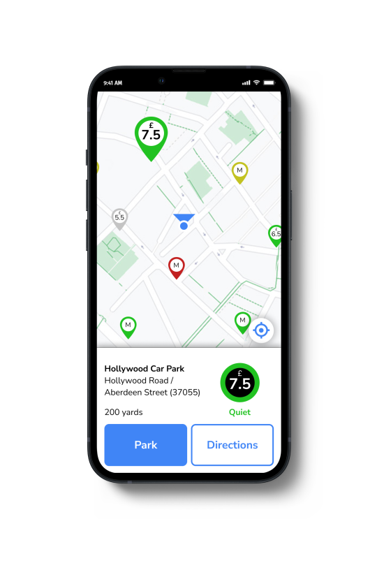
Parking profile: Thumb-driven design
Here is a display of more detailed information about a selected parking slot. Users have the option to choose between “Park” and “Directions”.
“Park” will lead them to the payment page, while “Directions” will take them to their default navigation app, which they are familiar with.
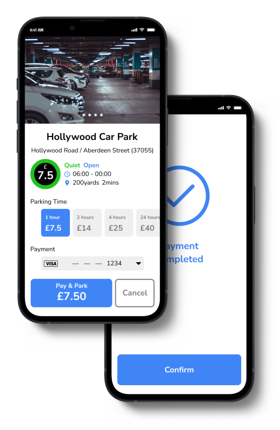
Payment: Larger primary button
Actions have been reduced to a maximum of three clicks for user convenience. The “Pay & Park” primary button is larger in size and highlighted in blue to make it stand out. All necessary details are displayed on the same page, eliminating the need for vertical scrolling.
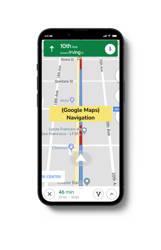
Navigation
ParKING will launch the default navigation app on the user’s phone to guide them to the designated parking spot. This way, users can navigate using an app they are already familiar with.
REFLECTIONS
“ParKING” was one of the very first UX project from my UX/UI course. I have constantly asked myself what I could have done better to create some business value. After months of editing my portfolio, I realised that I may have rushed into starting my work too quickly with my initial idea, which was to design an app that integrates information: real-time occupancy and fees of all car parks and meters.
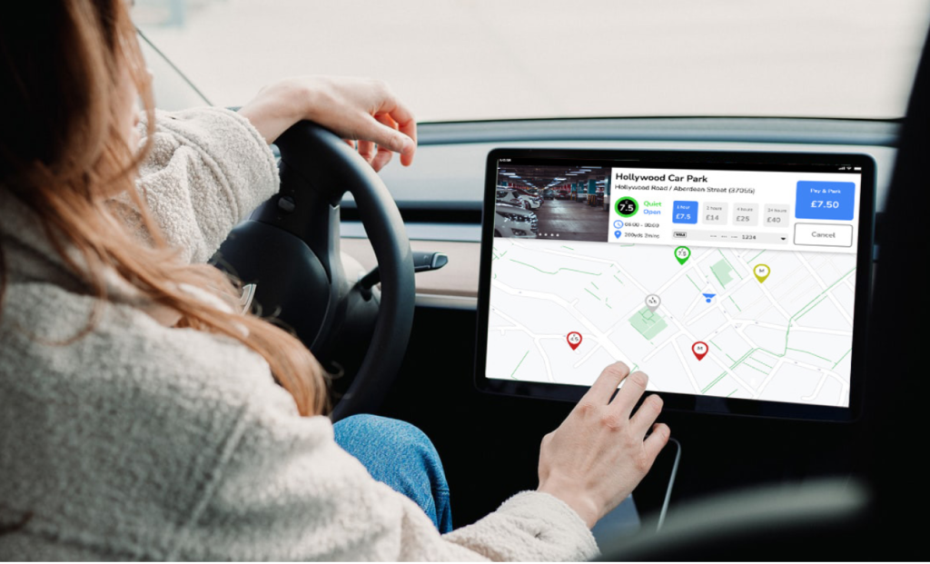
Now, “ParKING” is like an independent simple app with plenty to improve in order to create business value. I could think of adding more premium functions to improve it, such as saving parking locations and payment method, implementing a booking system, and so on. Also, partnering with prominent mall giants to offer special parking discount for users who shop at their malls could be a valuable opportunity.
